
Understanding complementary colors can significantly enhance your artwork.
Complementary colors are like best friends on opposite sides of the color wheel. They make each other stand out and create a harmonious balance in your composition.
Moreover, blending complementary colors can produce rich shadows, while mixing them creates neutral tones that add depth and sophistication to your art.
So, knowing your complementary colors isn’t just about picking shades; it’s about unlocking a world of possibilities to make your artwork pop and come to life.
The Basic Complementary Colors
Complementary colors are like best friends on a color wheel – they sit directly across from each other, creating the most eye-catching contrast possible.
Imagine red and green, or blue and orange, they’re like opposites that attract each other visually.
Now, why do they look so good together? Well, it’s all thanks to the amazing science happening in your eyes.
You see, the cells in your eyes that help you figure out colors, they get excited when they see certain colors.
If you stare at a color for a while, then quickly look at something else, you might see a brief flash of its complementary color.
So, embrace those complementary colors, they’re your secret weapon for creating visually stunning artwork!
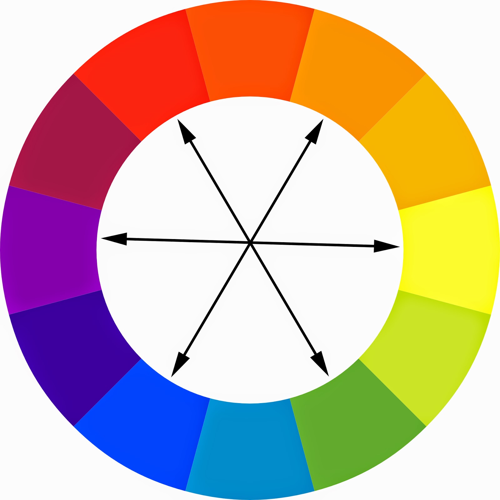
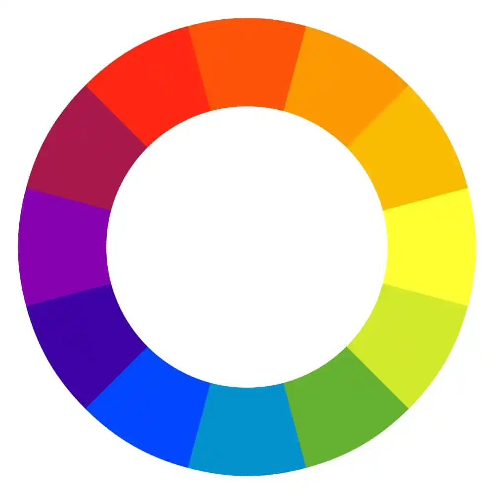
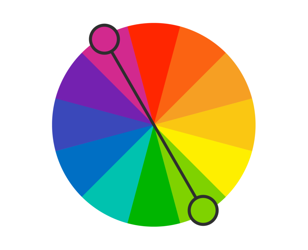
What Are the Complementary Colors?
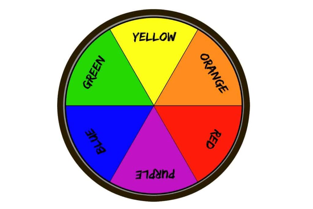
Complementary colors are pairs of colors that sit directly across from each other on a color wheel.
When you look at a standard 12-color wheel, you’ll find three main complementary pairs:
What’s interesting is that each pair consists of one Warm Color and one Cool Color.
This combination creates a strong contrast between them, making them appear brighter than other color pairings.
This brightness is what catches the viewer’s attention, making complementary colors perfect for making things stand out in your creative projects.
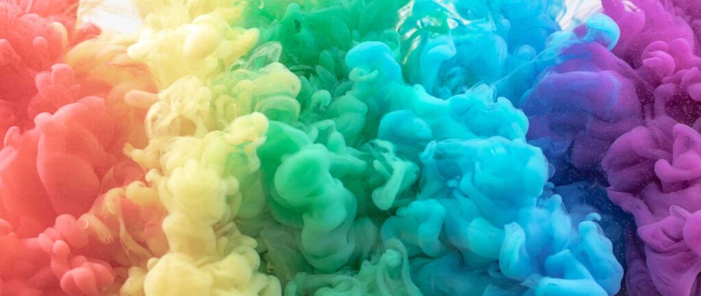
Examples of Complementary Colors in Art and Design
Complementary colors are like best buddies in the color world, they make each other look their best when paired together. Think of them as the perfect duo that always catches your eye and keeps you hooked.
Take classical painting for example, where artists like Van Gogh knew the magic of using complementary colors like blue and orange.
In his self-portraits, blue takes the spotlight, while hints of orange highlight features of his face. It’s like they were meant to be together, creating a captivating harmony.
Moving on to interior design, especially during festive times, you’ll often find the dynamic duo of red and green. They’re like the stars of holiday decorations, bringing warmth and cheer to any space they grace.
In the world of product photography, think of yellow and purple as the unexpected yet delightful pair. It’s not always about sticking to exact matches from the color wheel.
Experiment with different shades, like the deep purple of blueberries alongside vibrant yellow, to find what catches the eye just right.
And let’s not forget about graphic design, where complementary colors like blue and orange reign supreme.
Logos, in particular, love to flaunt these bold combos. They’re like a beacon in a sea of visuals, making brands easier to remember and recognize.
So, whether it’s in art, design, or even everyday life, complementary colors are the dynamic duos that steal the show, creating visual harmony that’s simply irresistible.
The Importance of Complementary Colors
Complementary colors are like best friends in the world of colors.
They’re like opposites that attract each other and make everything look lively and exciting.
When you put complementary colors together, like red and green or blue and orange, they create a powerful contrast.
This strong difference in color catches people’s attention right away.
This makes important things in pictures, paintings, or designs really pop out and grab your focus.
So, using complementary colors isn’t just about making things look pretty; it’s about making sure the important stuff gets noticed!
Benefits of Complementary Colors
Complementary colors are like best friends on a canvas – they make designs pop and keep things interesting.
Here’s why they’re so great:
- Eye-catching Visuals: Complementary colors make designs stand out. They catch your eye and make you want to look closer.
- Direct Attention: They help draw attention to the important parts of a design. It’s like they’re saying, “Hey, look here!“
- Engagement: By using complementary colors, you can keep people interested in what they’re seeing. It’s like a colorful magnet for their eyes.
- Text Clarity: These colors can actually make text easier to read. So, important information doesn’t get lost in the design.
- Emotional Connection: Different colors can make you feel different things. Complementary colors can help evoke specific emotions in viewers.
- Visual Balance: They ensure that all the parts of a design feel just right. Nothing sticks out too much or feels out of place.
- Brand Identity: By using specific color combinations, you can make your brand instantly recognizable. It’s like your design’s signature.
How Do Complementary Colors Work?

Complementary colors are like best buddies in the world of colors! They work together to make things look extra cool and pleasing to the eye.
Here’s why they’re such a dynamic duo:
Now, when you look at something for a long time, like a bright red apple, these color-loving cones get really excited.
But then, when you quickly glance at something neutral, like a plain white wall, something magical happens. You see a sort of ghostly image in the opposite color.
That’s where complementary colors come into play! They’re like opposites that attract.
So, when you look at that white wall after staring at the red apple, you might see a bluish-green ghostly image. That’s because blue-green is the complement, or the opposite, of red.
This phenomenon makes complementary colors super exciting to use together in art, design, or even fashion. They create this cool contrast that makes things pop and look even more awesome.
So, next time you see colors playing together, remember: it’s all about those complementary buddies!
How to Use Complementary Colors in Your Home?
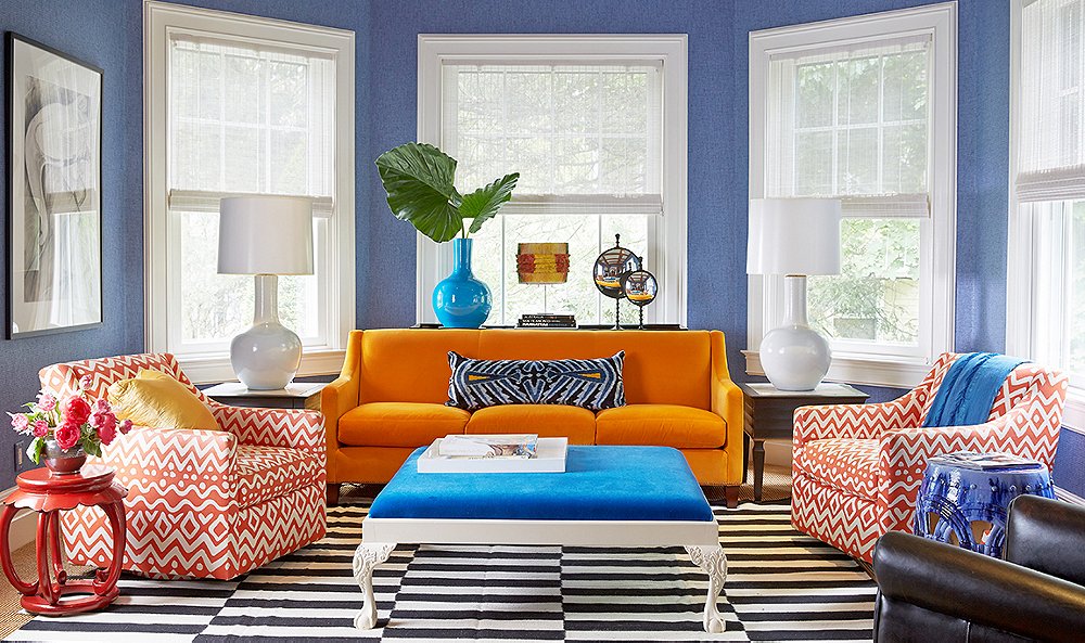
When it comes to decorating your home, understanding complementary colors can make a big difference.
Complementary colors are the ones opposite each other on the color wheel, like blue and orange, or red and green.
When you use complementary colors together, they make each other stand out more.
For example, a hint of orange in a blue room or a touch of blue in an orange room can really catch your eye because they make each other look brighter.
Combining two complementary colors can also create a feeling of balance and calmness because they stimulate different parts of your eye at the same time.
It’s like giving your eyes a little workout, which can make a space feel more interesting and harmonious.
So, if you want to add some energy and depth to your home decor, consider using complementary colors.
Just remember to balance them out so they don’t overwhelm the space.
Complementary Colors Generator
Adding a complementary color generator to your design toolkit can completely transform how you work on your projects.
This handy tool helps you find the ideal color combinations effortlessly.
All you need to do is click, and the generator shows you colors that are opposite each other on the color wheel.
This means you’ll get pairs of colors that really stand out together. It’s a simple yet powerful way to create eye-catching palettes for your designs.
Conclusion
In conclusion, understanding complementary colors is like discovering the perfect dance partner for your artwork. They create a vibrant harmony that makes your compositions sing with life.
By embracing complementary colors, you unlock a world of possibilities, where shadows deepen and neutral tones add sophistication.
From classical paintings to modern graphic designs, these dynamic duos steal the show, ensuring that what’s important grabs attention and resonates with viewers.
So, whether you’re a seasoned artist or a budding designer, let complementary colors be your guiding light, illuminating your creative journey with brilliance and allure.
Leave a Reply