
Understanding warm colors can significantly impact the emotional response of viewers to your designs.
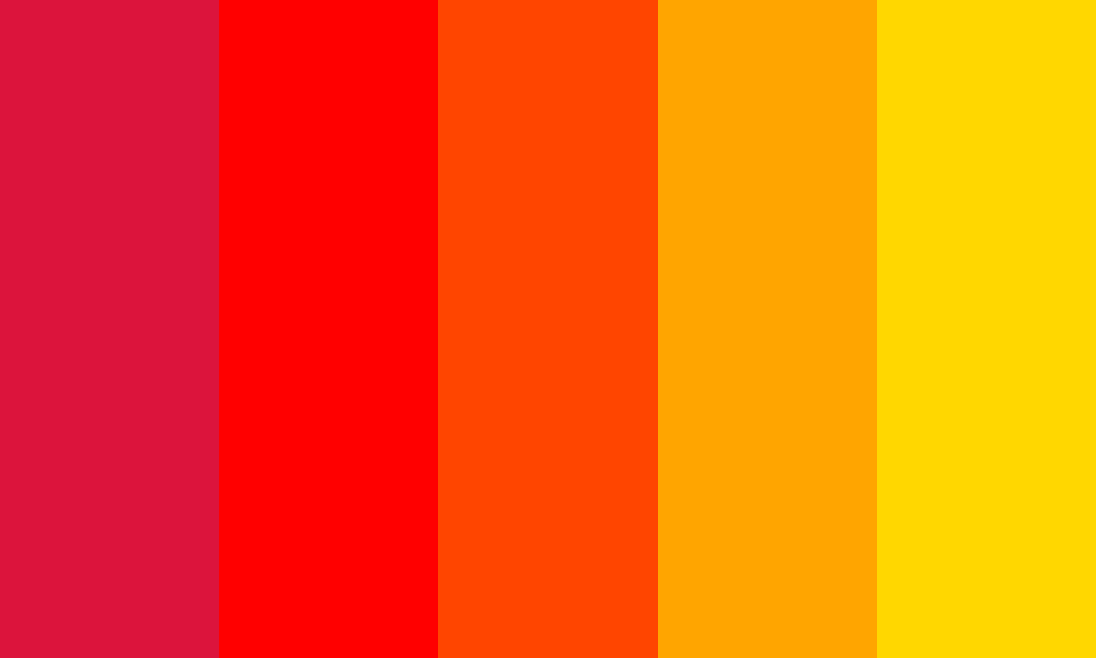
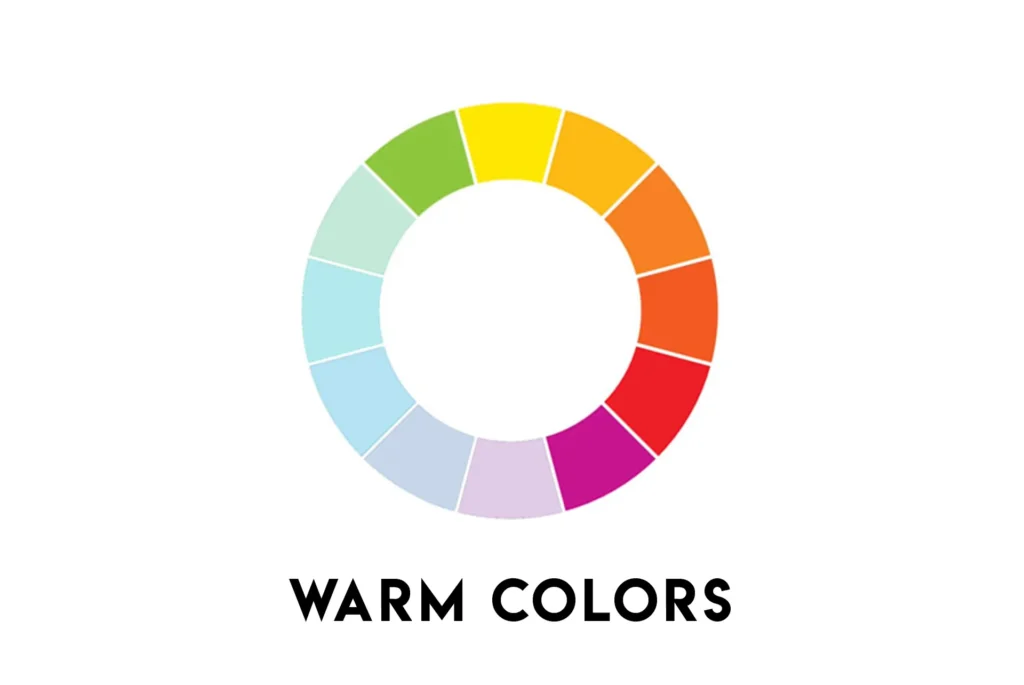
Warm colors like reds, yellows, and oranges create a sense of heat and brightness, evoking feelings of warmth and illumination. Incorporating these colors into your designs can make them more inviting and accessible.
In art and design, warm colors often represent elements like fire, light, and hot landscapes.
Thus, by grasping the meaning and usage of warm colors, you can effectively connect with your audience and elicit desired emotions in your designs.
Warm Colors Definition
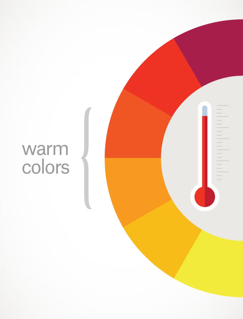
Warm colors, including red, orange, and yellow, bring to mind feelings of warmth, sunlight, and energy.
They are often used to create a cozy and inviting atmosphere, especially in large spaces like bedrooms. These colors tend to visually advance, making spaces feel more intimate.
Red is a highly visible color and is commonly used for attention-grabbing elements like CTA buttons and headlines. It suggests urgency and can stimulate appetite, which is why it’s popular in restaurant branding.
Orange, another warm color, signifies energy and excitement. It’s often used to create a sense of urgency and happiness, resembling the warmth of the sun. This makes it ideal for businesses aiming to create an inviting atmosphere.
Yellow evokes feelings of joy, happiness, and optimism. It’s excellent for drawing attention to specific elements in design, such as accents or highlights on websites or graphic projects. Using yellow can help emphasize important aspects and make them more noticeable to viewers.
Psychological Effects of Warm Colors
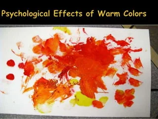
Warm colors, like red and orange, have a special effect on our minds and emotions. They make us feel cozy, welcomed, and secure.
When we see these colors, we might be reminded of happy times, like summer vacations or fun days at the beach.
These warm colors work best in big spaces, making them feel even more inviting and lively. They can also give us a sudden burst of energy, making us feel more active and alive. That’s why you often see them in places like gyms and living rooms.
In advertising, these colors are used to grab our attention and make us act quickly. Think of red stop signs or yellow warning signs—they’re hard to ignore. Advertisers know that these colors make us take notice and take action.
Overall, warm colors make us feel uplifted and positive. They’re like a ray of sunshine, brightening our mood and outlook. Surrounding ourselves with these colors can contribute to better mental health, keeping us feeling optimistic and encouraged.
Common Variations of Warm Colors
Variations of warm colors offer different vibes and effects in design.
Let’s break down these variations:
- Monochromatic Warm Colors: When you stick to one warm color and play with its shades, tones, and values, you get a monochromatic scheme. This creates a cozy and balanced feeling. For instance, if you pick various shades of red, it evokes warmth and comfort, reminiscent of fire’s glow.
- Complementary Colors with Warm Colors: Complementary colors are opposite each other on the color wheel. So, when you pair warm colors with their opposites, you get a striking contrast. Think of orange and blue together; they pop and grab attention. This high contrast adds visual interest to your design.
- Analogous Warm Colors: Analogous colors are neighbors on the color wheel. So, using warm colors like red, orange, and yellow-red together creates a harmonious blend. These colors sit close, offering unity and order to your design. You can also play with subtle differences within these similar hues, like mixing oranges and yellows, to add depth without overwhelming the design.
How To Use Warm Colors in Graphic Design?
Using warm colors in graphic design can significantly enhance your projects.
Here’s how you can effectively incorporate them:
- Attract Attention: Warm colors like reds, oranges, and yellows naturally draw the eye. When you want to highlight a specific part of your design, make it pop by using warm hues in that area. This ensures your focal point grabs the viewer’s attention immediately.
- Create Contrast: Warm colors can create dynamic contrast, especially when paired with cool tones. Adding a warm color to a predominantly cool palette can make certain elements stand out, adding visual interest and depth to your design.
- Consider Relative Color Temperatures: Warm tones don’t just stop at reds and oranges. Even colors like violet-blue can have warm undertones. Understanding how different warm colors interact with each other and with cooler shades can help you craft a more cohesive and impactful color palette.
- Harness Color Psychology: Warm colors are often associated with positivity and happiness. By incorporating them into your design, you can evoke these feelings in your audience. For instance, using warm shades in fonts or backgrounds can uplift the mood of your graphic and create a more cheerful atmosphere.
- Limit Your Palette: Too many colors can overwhelm and confuse viewers. By sticking to a limited color palette, especially one dominated by warm hues, you can create a cohesive look and evoke a specific mood or emotion more effectively. This ensures your message comes across clearly without distractions.
Remember, experimentation is key. Try different combinations of warm colors and observe how they affect the overall feel of your design. By understanding the effects of warm colors and how to use them strategically, you can create visually compelling and emotionally resonant designs that leave a lasting impression on your audience.
Uses of Warm Color in Home Decor
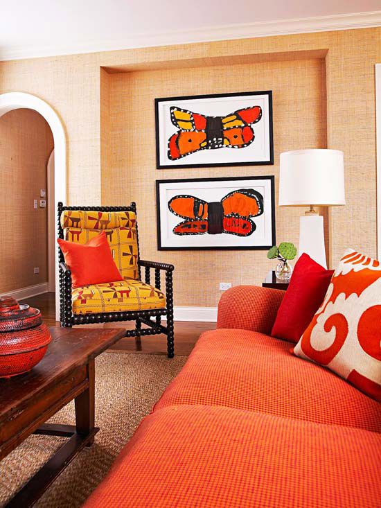
Warm colors like red, orange, and yellow are like cozy blankets for your home. They make a room feel snug and inviting because they seem to come closer to you, creating a sense of warmth and intimacy.
When you use warm colors in your home, it’s like giving each room a warm hug. They make spaces feel cozy and welcoming, perfect for relaxation and comfort.
But too much warmth can be overwhelming. That’s where cool colors come in. They balance out the warmth, creating harmony in your home decor.
Even something as simple as off-white paint on your walls adds a touch of warmth without being too flashy. It’s like the quiet friend who keeps things calm and peaceful.
So, when decorating your home, remember that warm colors bring the cozy vibes, but a little coolness keeps everything in balance.
Conclusion
In conclusion, understanding warm colors goes beyond mere aesthetics; it’s about tapping into the emotions and psychological responses they evoke.
By grasping the essence of warm hues like reds, oranges, and yellows, you gain the power to create designs that resonate deeply with your audience.
Whether you’re aiming for a cozy ambiance, dynamic contrast, or harmonious unity, warm colors offer a versatile palette to express your creativity.
So, embrace the warmth, experiment with combinations, and let your designs shine with the radiant energy of these captivating hues.
Just remember, like a well-balanced home decor, a thoughtful integration of warm colors can make your designs feel like a warm hug—inviting, comforting, and unforgettable.
Leave a Reply