
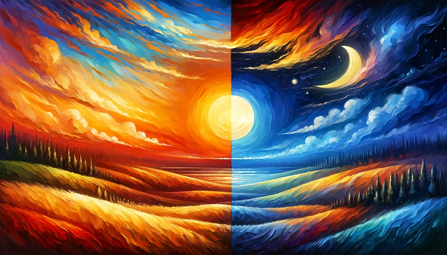
Colors play a significant role not just in art but also in our everyday lives, shaping our emotions and perceptions. Among these, cool colors hold a special place, contributing to the creation of depth, shadows, and contrast in artworks.
Cool hues evoke associations with elements like the sky, ocean, and natural landscapes, instilling a sense of tranquility and peace. But what exactly constitutes cool colors?
Delve into the creation process of cool hues and explore their profound impact on art and beyond.
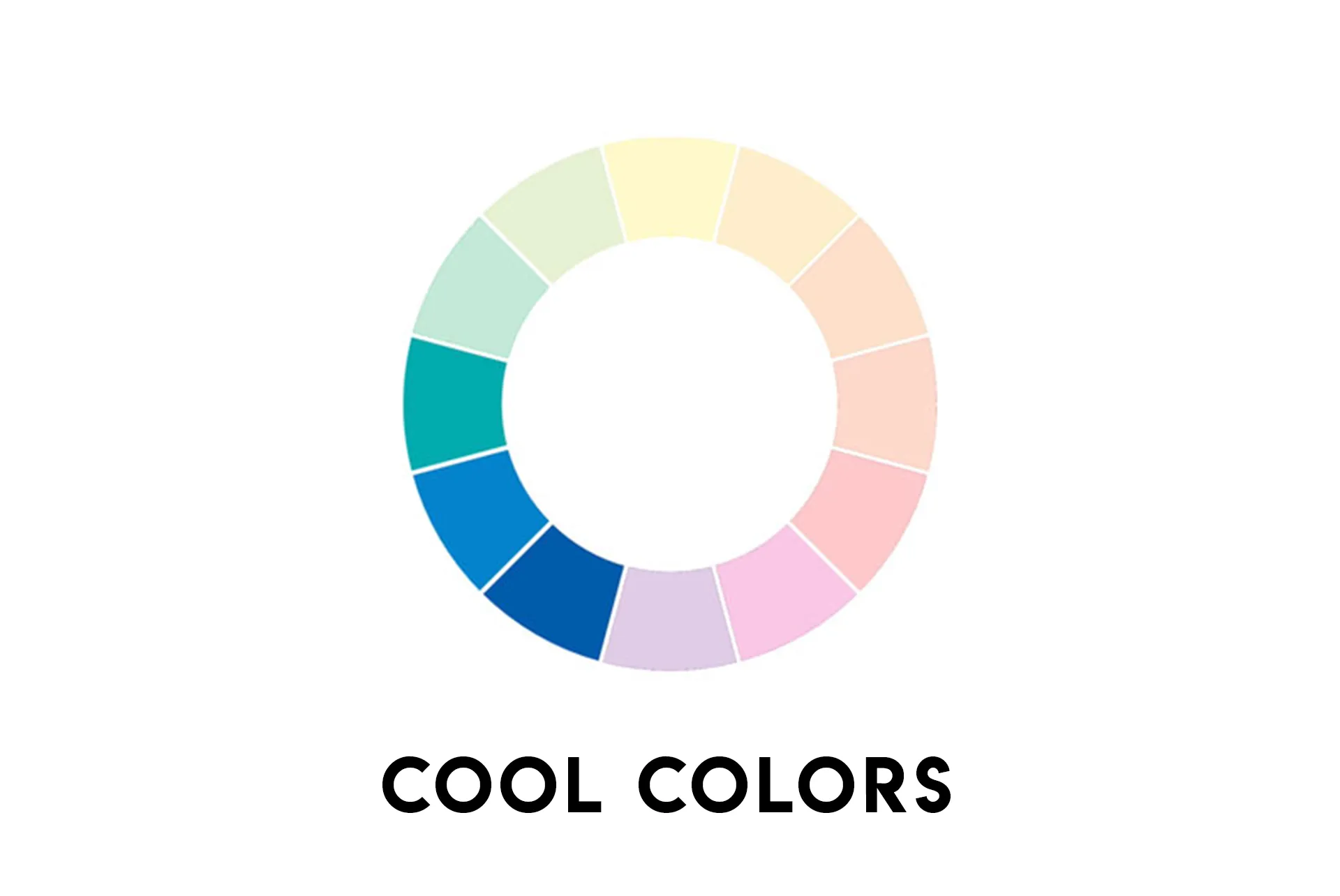
What Are Cool Colors?
Cool colors refer to a specific range of hues that give off a chilly or calming vibe.
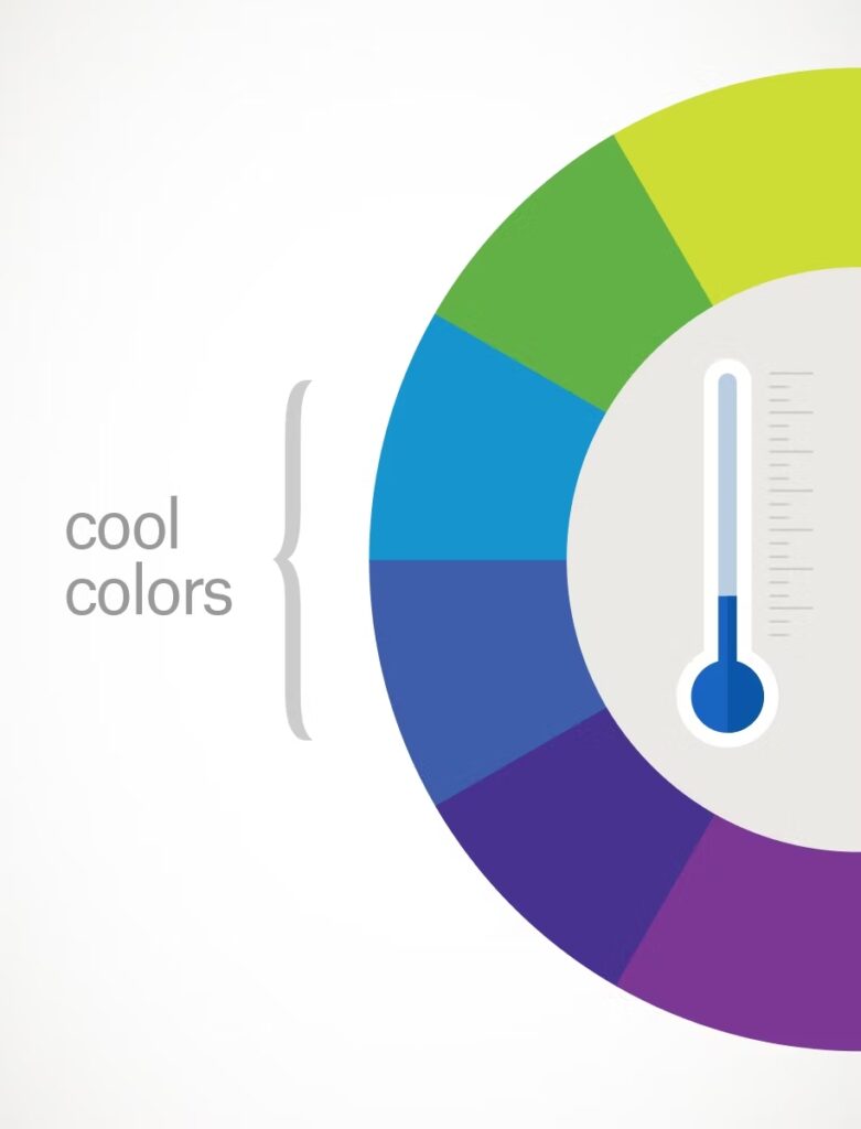
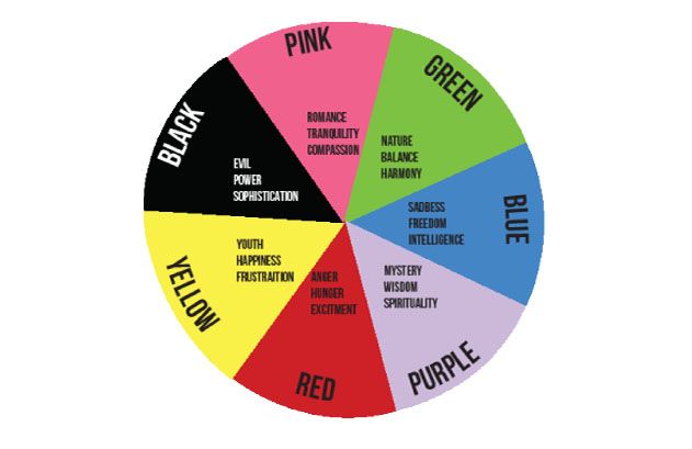
Picture serene scenes like the deep blue ocean, lush green forests, or the soft violet hues of twilight. These colors are found on one side of the color wheel, primarily consisting of blues, greens, and violets, along with shades that blend them together.
When you think of cool colors, think of cool environments like a clear sky or icy glaciers.
In comparison, warm colors bring to mind images of warmth, like the fiery glow of a sunset or the vibrant colors of autumn leaves. Warm colors include shades of red, orange, and yellow, along with any mixtures of these hues.
So, in essence, cool colors are those that give off a refreshing and soothing feel, contrasting with the warmth and energy of their counterparts.
How Are Cool Colors Made?
Cool colors are those that give off a refreshing, calming vibe, like the blues and greens you might see in a peaceful ocean or a shady forest.
But how are these cool colors made? Well, it all comes down to the magic of color mixing.
First off, blue is the superstar of cool colors. It’s the only primary color in the cool group, which means it’s like the cool captain leading the team.
So, when we talk about cool colors, we’re often talking about shades that have some blue in them or a hint of that cool blue vibe.
Now, let’s dive into the world of hexadecimal or hex codes. These fancy codes help us communicate exactly which color we’re talking about.
They also give us a clue about how much blue or other colors are mixed in to create that specific shade.
So, if you’re ever wondering if a color is cool or warm, checking out its hex code can be a handy trick.
But it’s not just about adding blue. Even neutrals colors like black, white, and gray play a role in color temperature. White tends to have a cooling effect, giving things a fresh vibe.
On the flip side, black brings warmth to the party. Mixing a touch of blue with white can make it even cooler.
Now, what about earthy tones like brown? Well, their temperature depends on the mix. If you use mostly cool hues, you’ll end up with cool neutrals. And if you use warm colors, you’ll get warmer tones.
So, there you have it! Cool colors get their coolness from the power of blue and a little help from their color friends like white and the right mix of earthy tones.
Psychological Effects of Cool Colors
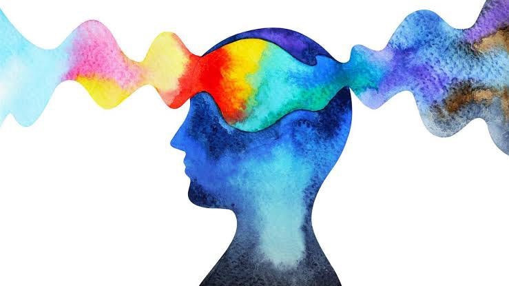
Cool colors, like green, blue, and violet, have a remarkable impact on our minds and emotions. They’re often associated with nature and the outdoors, but they work wonders even in small spaces, making them seem larger than they are.
One of the coolest things about cool colors is their ability to calm us down. When we’re stressed, anxious, or worried, these hues can help eliminate those negative feelings, giving us a sense of tranquility. Being around these colors can feel like taking a deep breath of fresh air.
But the benefits of cool colors go beyond just making us feel good. They can actually inspire us to take better care of ourselves. Seeing these colors reminds us that our health and well-being are important, empowering us to make positive choices. That’s why incorporating cool hues into things like logos and branding for health-related businesses could be a smart move.
Cool tones also encourage us to seek wisdom and understanding, pushing us to be better versions of ourselves. They’re supportive and enlightening, triggering strong responses without causing any negative effects on our behavior or mood.
In short, cool colors are more than just pretty shades – they’re powerful allies in promoting relaxation, well-being, and personal growth.
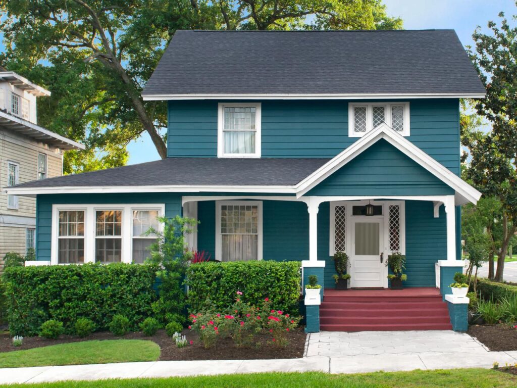
Visual Impacts of Cooler Colors
Cooler colors, like blues and grays, are often used in backgrounds of various artistic works, such as paintings or photographs. They create a sense of distance, making things in the background appear smaller than they actually are.
For instance, when you see a landscape painting with distant mountains fading into blue hues, or a picture of a house by the ocean with the vast expanse of blue water behind it, these cooler colors help convey the feeling of space and distance.
However, there’s sometimes confusion about what exactly constitutes a cooler color.
While many people think of darker shades when they hear “cool colors,” in reality, cooler colors can include lighter hues that tend towards gray rather than vibrant, bright tones.
This misunderstanding can lead to confusion between clients and designers when discussing color choices.
Overall, cooler colors play a crucial role in visual communication, helping to convey distance, technology, and mood in various artistic and design contexts.
Cool Colors in Interior Design
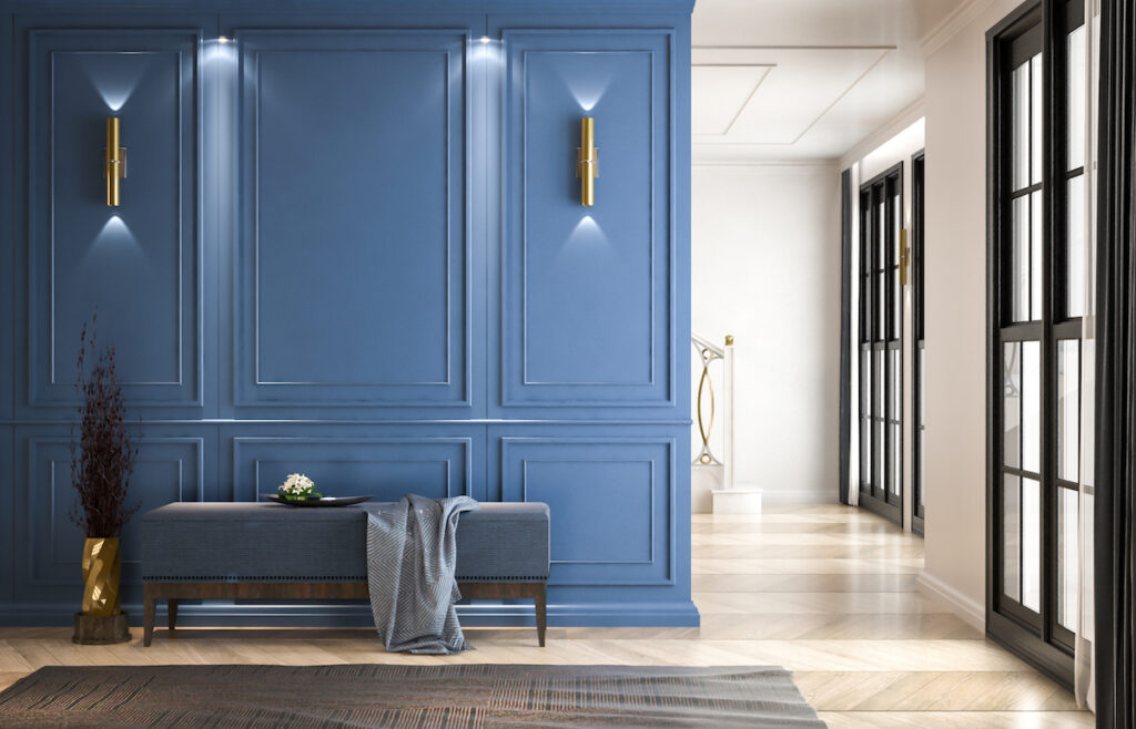
Cool colors in interior design aren’t just about picking one color and sticking with it. It’s more like creating a beautiful painting. You mix different shades together to get the perfect look.
Imagine painting a room blue. Instead of just one shade of blue, you might use several different shades – like light blue, medium blue, and dark blue.
This creates a calming and soothing atmosphere. It’s like when you look at a beautiful ocean with different shades of blue blending together.
It’s kind of like painting a sports car too. Sports cars usually have one main color, but they also have a secondary color for details like the trim.
With cool colors, it’s more about blending different shades of the same color family to make everything look harmonious and stylish.
Cool Colors in Your Home
When it comes to decorating your home, think about color like you would when painting a picture.
The temperature of the colors you choose can really change the vibe of a room. Cool colors, like blues and greens, can make a space feel bigger and more relaxed.
They can also help set a calm and peaceful mood. So, if you want your home to feel spacious and tranquil, consider adding some cool colors to the mix!
Effect of Cool Colors on Size
Cool colors, like blues, greens, and purples, can work magic in small rooms.When you look at a painting with cool colors, they seem to step back, creating an illusion of depth. Similarly, in your home, using cool tones can make tight spaces feel way more spacious.
So, if your kitchen or living room is on the snug side, think about opting for cool colors. Warm tones, on the other hand, have a knack for making spaces feel closer and cozier. That’s why it’s best to save them for bigger rooms where you want that snug, intimate vibe.
Effect of Cool Colors on Emotion
Cool colors, like blues, greens, and purples, have a calming effect on our emotions. They can help create a tranquil atmosphere in places like bedrooms and bathrooms, where relaxation is key. Cool tones can also improve focus, making them a smart choice for home offices.
If you live in a warm climate, using cool colors can make your space feel airy and refreshing, as they have a cooling effect. On the other hand, warm colors like reds, oranges, and yellows are more stimulating and are better suited for lively areas like living rooms.
So, when deciding on colors for your home, think about the mood you want to create in each room and consider the climate of your location to make the most of the effects of cool colors.
Effect of Cool Colors on Balance

In your home, the choice of cool colors can greatly affect the balance and atmosphere of a room. Just like in painting, where a balance between cool and warm colors is crucial, the same principle applies to your living space.
If your room’s main color scheme leans towards cool tones, it’s essential to incorporate some warm accent pieces. Without these warm touches, the room might feel dull and lacking vibrancy. On the other hand, even in warmer rooms, adding cool colors can prevent the space from feeling too stuffy or overwhelming.
Cool colors not only impact the aesthetics of your home but also play a role in creating dimension, contrast, and mood. Learning how to balance cool and warm colors is a fundamental skill that can significantly enhance the overall look and feel of your living space.
How Can I Tell if a Color is Cool?

To understand if a color is cool, think about the feeling it gives you. Cool colors are like those crisp, chilly winter days. They have a touch of blue or white in them. Imagine looking at a color wheel; it divides colors into warm and cool ones. But it’s not as confusing as it seems.
When we talk about cool and warm colors, we’re talking about seasons like cool winter or cool summer. These seasons cover all colors, even warm ones. That’s because there are cooler versions of warm colors.
Take green, for instance. It’s usually warm, but there are cooler shades of green. Compare a cool green to a warm one. The cool green has more blue, making it feel cooler. The warm green has more yellow, giving it warmth.
Picture painting a winter scene. You’d use crisp white with a hint of bright blue to make it look cold. For an autumn scene, you’d add lots of yellow to capture the warmth of the sun.
It can be tricky to spot these differences if you’re not used to it. If you find it hard to see the subtleties in color, working with a color analyst could help you a lot. They’re experts at understanding color and can guide you to find the perfect shades for what you want to create or wear.
Conclusion
Cool colors wield a profound influence, not just in aesthetics, but in our emotional and spatial perceptions. From the calming blues of the ocean to the refreshing greens of a forest, these hues evoke tranquility and expansiveness.
Understanding their composition reveals a delicate interplay of blues, greens, and violets, blending to create a symphony of coolness. Yet, their impact extends beyond the visual realm; they soothe our minds, inspiring personal growth and positive choices. In design, cool colors convey distance, mood, and technology, enriching our visual communication.
So, whether decorating a home or embarking on a creative endeavor, embracing cool colors transforms not only the visual landscape but also the emotional atmosphere, inviting serenity and harmony into our lives.
Leave a Reply