
Harmony in art is like the perfect melody in a song, where different notes blend seamlessly to create a pleasing tune.
In the world of art, harmony is one of the seven key principles that artists use to make their creations visually appealing.
Throughout history, artists have used harmony to great effect in their paintings, sculptures, and other works of art.
In this article, we’ll explore what harmony means in art, the three main types of harmony, and how artists achieve it.
We’ll also take a look at some famous artworks to see harmony in action. So, get ready to embark on a journey through the harmonious world of art!
What Is Harmony In Art?
Harmony in art is like the perfect blend of ingredients in a recipe that makes a delicious dish.
It’s when all the different parts of a painting, sculpture, or any artwork come together in a way that feels right and pleasing to look at.
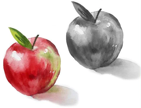
But harmony doesn’t mean everything has to be exactly the same. Sometimes, artists use different elements, but they still make them fit together by using similar colors or themes.
It’s like having different instruments in a band playing different notes, but they all come together to make beautiful music.
However, too much harmony can be a bit boring. Just like in music, you need some contrast to keep things interesting. If everything in a painting is too similar, it can feel dull.
So, artists often add a little touch of something different to keep things lively. It’s all about finding the right balance between sameness and variety to create art that really sings.
7 Principles of Art
Harmony is one of the principles of art, not elements of art.
You can learn about each principle of art and element of art in the linked articles below:
- Balance
- Contrast and Emphasis
- Movement and Rhythm
- Unity and Variety
- Harmony (we are reading about Harmony now!)
- Pattern
- Proportions and Scale
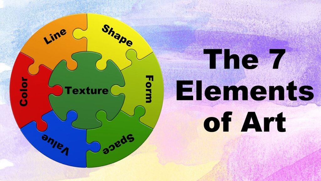
7 Elements of Art
Examples Of Harmony In Art

In art, harmony refers to the pleasing arrangement of elements within a composition.
One way artists achieve harmony is through complementary colors, which have strong contrast but can still work well together.
Claude Monet employed strategies to create harmony in his works.
In ‘Woman with Parasol‘, he achieves harmony through texture and brushwork.
The organic strokes depicting wind in the clouds are echoed in the woman’s dress, creating a connection between the figure and the landscape.
Another artist, Henry Moore, mastered harmony through the repetition of natural shapes and curves in his sculptures.
By blending visionary ideas with structural harmony, Moore crafted emotionally captivating artworks.
Why is Harmony in Art Important?

Harmony in art is like the glue that holds everything together in a painting, drawing, or any other form of art.
Imagine you’re baking a cake; you don’t want one ingredient to stand out too much or clash with the others. You want them all to blend together nicely to make a delicious treat. That’s what harmony does in art.
When everything in an artwork harmonizes, it makes the piece feel balanced and pleasing to look at. It’s like a beautiful melody in music where all the notes fit together perfectly.
Without harmony, art might feel chaotic or disjointed, and viewers might not enjoy it as much.
So, harmony isn’t just about making something pretty; it’s about making something that feels whole and complete, drawing us in and making us feel good when we look at it.
That’s why harmony in art is so important.
Types Of Art Harmony
Achieving harmony in art is done by using important art elements such as color, value, shape, form, and texture.
Let’s take a detailed look at examples of color and value, shape and form, and texture harmony to see how these different visual elements cooperate to create harmony in art.
Color and Value Harmony
Color harmony in art is like putting together a perfect mix of colors that feel just right when you look at them.
It’s achieved in various ways, but one common method is by using colors that are related to each other on the color wheel.
Imagine the color wheel as a circle with all the different colors on it. When colors are next to each other on this wheel, they tend to look good together.
Another way to create color harmony is by sticking to variations of one single color.
This is called a monochromatic color scheme. It’s like picking different shades of blue and using them together in a painting. This can make the artwork feel unified and balanced.
An example of color harmony in art can be seen in Claude Monet’s paintings. In his famous work “Water Lilies,” Monet uses shades of blue and green, which are next to each other on the color wheel, creating a calming and harmonious atmosphere.
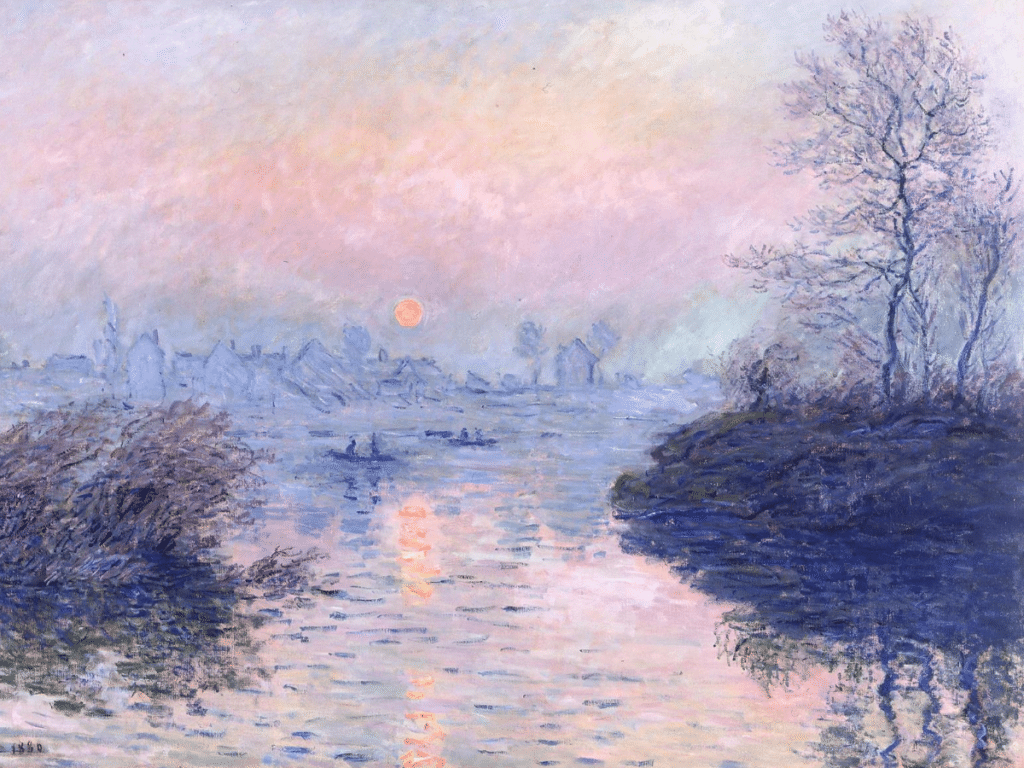
Similarly, in “Waterloo Bridge, London, at Sunset,” Monet incorporates blue and gray tones with hints of pink and orange, balancing the colors to evoke a sense of tranquility and harmony, mimicking the atmosphere of a calm, foggy day in London.
Shape and Form Harmony
Shape and form harmony in art refers to the consistent use of similar shapes or forms within a composition.
These shapes can either be organic, like those found in nature, or geometric, such as triangles, rectangles, squares, and circles.
For example, in Henri-Edmond Cross’s painting “Two Women by the Shore, Mediterranean,” organic shapes are used throughout the artwork to create harmony.
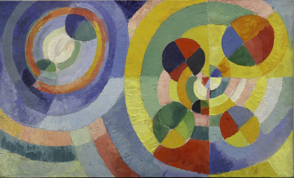
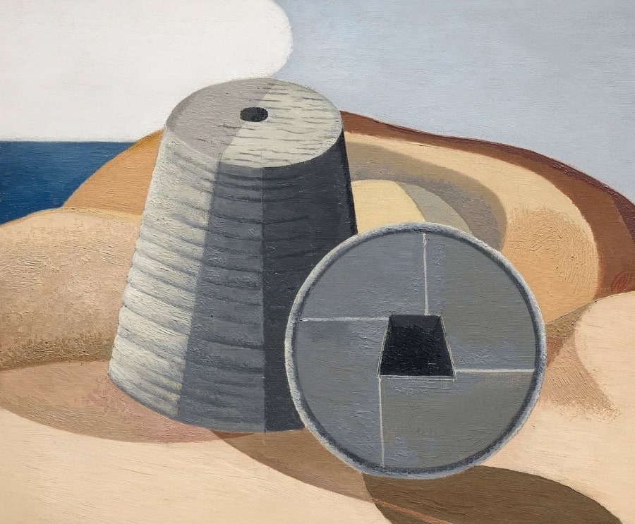
Similarly, Paul Nash’s painting “Mineral Objects” employs geometric circular shapes, even in the background, to achieve visual cohesion.
Moreover, textile patterns by William Morris exemplify how shapes and forms can create harmony.
His designs, like the fruit pattern, demonstrate a balanced combination of organic shapes, colors, movement, and negative space, resulting in a visually pleasing and harmonious image.
In essence, shape and form harmony in art is about using similar shapes or forms consistently to create patterns and coherence within the artwork’s composition, contributing to its overall aesthetic appeal.
Texture Harmony

Texture harmony in art refers to the consistency of brushstrokes or the application of paint, resulting in a unified feel throughout a painting.
This can be achieved through techniques like impasto, where paint is thickly applied to keep the brush’s imprint, or pointillism, which uses small dots or strokes of color.
For instance, Vincent Van Gogh used the impasto technique in paintings like “Olive Trees with yellow sky and sun” and “Cypresses,” where thick paint strokes create a cohesive texture across the canvas.
Similarly, pointillism, pioneered by Georges Seurat, creates texture harmony by using small dots of color, as seen in Henri-Edmond Cross’s “The Pink Cloud.”
In essence, texture harmony ensures that the brushstrokes or application of paint throughout a painting maintain a consistent rhythm, contributing to the overall unity and aesthetic appeal of the artwork.
Principles of Harmony in Art

Harmony in art is like a symphony where everything comes together in a pleasing way.
Imagine you’re baking a cake. You need to make sure you put in the right amount of each ingredient so it tastes just right.
Similarly, in art, you’ve got to check the proportions and balance to make sure everything fits together nicely.
Now, think of a puzzle. Each piece is different, but when you put them all together, they create a beautiful picture.
That’s what unity in art is about. Every part of the artwork should fit together like puzzle pieces, creating a complete and cohesive whole.
Lastly, imagine visiting a museum where you see artworks from different parts of the world. Each piece reflects its own culture and history.
That’s the beauty of art – it’s a universal language that can express a wide range of cultural expressions.
So, when we talk about harmony in art, it’s not just about how things look together, but also about how they reflect the diversity and richness of human experiences.
Conclusion
In summary, harmony in art is the symphony of visual elements coming together to create a pleasing and unified whole.
It’s akin to crafting a perfect recipe where every ingredient complements the others, or assembling a puzzle where each piece contributes to the overall picture.
From the seamless blend of colors and shapes to the consistent texture throughout a piece, harmony ensures that every part fits together cohesively, like notes in a beautiful melody.
Yet, just as in life, it’s the balance between sameness and contrast that keeps things interesting.
Harmony not only makes art visually appealing but also reflects the diversity and richness of human experiences, echoing the universal language of creativity across cultures and history.
So, whether it’s Monet’s serene landscapes or Moore’s captivating sculptures, harmony in art continues to resonate, inviting us to immerse ourselves in its harmonious embrace.
Leave a Reply