
Understanding color theory is essential for any artist looking to succeed in their craft. It’s like having a secret recipe that makes your artwork stand out in a crowd.
Color theory isn’t just a bunch of random rules – it’s a toolbox full of guidelines and principles that help artists decide which colors to use and how to use them effectively.
In today’s guide, we’re diving deep into the world of color theory. We’ll touch on the psychology behind colors and how they can evoke emotions in your audience.
By the end of this journey, you’ll have a solid grasp of color theory and be equipped to use it to your advantage in your own art.
So let’s dive in and discover the colorful world of artistic expression together!
What is Color Theory For Artists?

Color theory for artists is like a toolbox full of tricks to make our artwork visually stunning and meaningful.
It’s about understanding how colors work together, how they affect our feelings, and how to use them to convey messages or moods in our art.
Key concepts in color theory include things like the color wheel, which shows how colors relate to each other, and understanding warm and cool colors.
It’s also about creating harmony in your artwork, making sure the colors work well together and enhance the overall feeling you’re trying to convey.
Even if you’re self-taught, learning color theory is crucial for any artist. It’s what makes your art appealing and helps you connect with your audience.
So, by mastering color theory, you’re not just making pretty pictures; you’re creating meaningful experiences for those who see your art.
The History of Color Theory
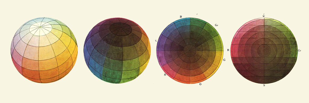
Color theory, the study of how colors interact and relate to each other, has a rich history dating back centuries. It all began with thinkers like Leone Battista Alberti and Leonardo da Vinci, who explored color’s properties and relationships.
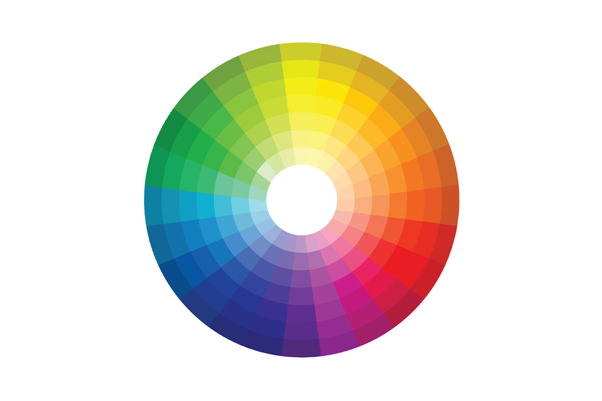
However, it was Sir Isaac Newton in the 17th century who crafted the first color wheel, a revolutionary tool featuring the primary colors of red, blue, and yellow, along with their combinations.
The color wheel has since become an essential tool for artists, helping them understand how colors work together. It divides colors into primary (red, blue, yellow), secondary (green, orange, purple), and tertiary (mixtures of primary and secondary colors) categories.
Knowing these basics allows artists to create a wide range of colors by mixing primaries. That’s why having a good grasp of color theory is crucial for painters—it empowers them to mix colors effectively and express their creativity accurately.
So, whether you’re painting a landscape or a portrait, having those primary colors on your palette is a must!
The Psychology of Color Theory
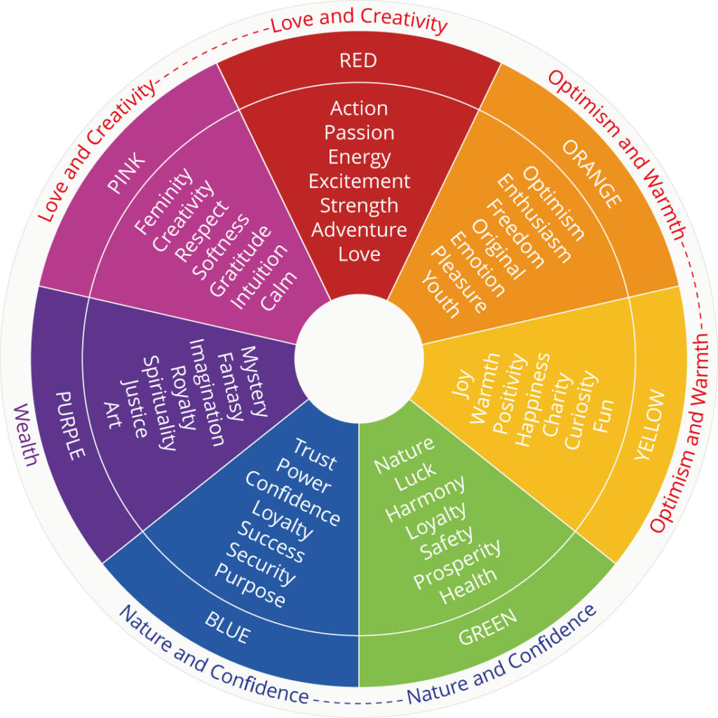
Color has a sneaky way of messing with our minds and feelings.
Think of it like this: when you see red, you might feel all fiery and passionate, or even a bit angry or scared. Orange can make you feel lively and full of ideas. Yellow is like a burst of energy and optimism. Green brings out feelings of health and nature, maybe even a bit of wealth. When you see blue, you might feel safe and peaceful, like you’re floating in a spiritual bubble. Purple is all about creativity and feeling fancy, like royalty.
Now, imagine you’re painting a picture and you want people to feel a certain way when they look at it.
If you want them to feel fired up and intense, go for those reds and warm colors. But if you’re aiming for a chill vibe, you’ll want to splash some greens and blues around.
Basically, you can play with colors to make people feel exactly what you want them to feel when they look at your masterpiece.
Learning Color Theory as an Artist

Learning color theory as an artist doesn’t have to be overwhelming.
Here’s a simple way to approach it:
- Get a color wheel or make your own using paints.
- Mix your own value charts for the twelve colors on the wheel.
- Start with your base color and adjust its value by adding white (for tints) or black (for shades).
- Create a range of charts for reference in future paintings.
- Practice painting with a limited palette to force yourself to mix colors, helping you understand how they interact.
By following these steps, you’ll build a solid foundation in color theory that will enhance your artwork.
Balancing Colors

When you’re choosing colors for a project, it’s important to strike a balance.
Here’s how you can do it:
- Pick a Primary Color: Start by selecting a main color. This color will be the star of your design, taking up around 60-80% of the space. Think of it as the foundation for your palette.
- Watch Your Saturation: Saturation refers to how intense a color appears. For the most important parts of your design, like the focal point, go for vibrant, saturated colors. Then, for supporting elements, dial down the saturation a bit. This helps to maintain a sense of hierarchy and order.
- Create Contrast: Contrast adds depth and visual interest. You want your colors to stand out from each other, but not clash. One way to achieve this is by using light and dark colors, or warm and cool colors, together. The highest contrast should be around your focal point, drawing attention where it’s needed most.
By following these guidelines, you can create a harmonious color scheme that enhances your design without overwhelming it.
Conclusion
In conclusion, mastering color theory is like unlocking the secrets of the artistic universe.
It’s not just about mixing paint or choosing hues randomly; it’s about understanding the language of colors and using it to speak to your audience.
Color theory isn’t just for the elite; it’s a tool that every artist can wield to elevate their craft.
By grasping concepts like the psychology of color and balancing hues effectively, you can create artwork that not only captivates the eyes but also stirs the soul.
So, whether you’re a seasoned painter or just starting out, embrace the colorful journey of artistic expression and let your creativity shine through every stroke of the brush.
Leave a Reply