Primary colors are a set of colors that are considered fundamental and cannot be created by mixing other colors. In traditional color theory, the primary colors are red, blue, and yellow. These colors are often used as the basis for creating all other colors in the color spectrum.
What are primary colors in art ?
In art, primary colors refer to a set of colors that are considered the foundation for mixing and creating other colors. The primary colors in art are different from the primary colors in traditional color theory.
In the subtractive color model commonly used in art and pigments, the primary colors are:
Red: A warm hue often associated with energy, passion, and intensity.
Blue: A cool hue representing calmness, stability, and serenity.
Yellow: A bright hue symbolizing happiness, optimism, and warmth.
These three primary colors are used as a basis for mixing and creating a wide range of secondary and tertiary colors. When combined in different proportions, they can produce an extensive palette of hues and shades.

It’s worth noting that different artists and art theories may have variations in their understanding of primary colors. Some may consider cyan, magenta, and yellow as the primary colors, especially in printing and modern color theory. Others may include additional colors like green as primary colors depending on their preferred color mixing system.
Ultimately, primary colors in art are the essential colors used as building blocks for creating a multitude of hues and tones in paintings, drawings, and other visual artworks.
Primary Color Scheme
A primary color scheme is a color palette that consists solely of the three primary colors: red, blue, and yellow. This color scheme is often considered basic, bold, and vibrant. It provides a strong visual impact and can be used to create contrast and emphasis in various artistic compositions.
When using a primary color scheme, artists typically rely on the pure hues of red, blue, and yellow without any mixing or dilution. The colors can be used in their full intensity or adjusted by using lighter or darker values.

Primary color schemes can evoke a sense of simplicity and clarity, and they are commonly associated with children’s art, graphic design, and certain styles of modern and abstract art. They can be particularly effective when creating artworks with a bold and minimalist aesthetic or when aiming for a strong visual impact.
While primary colors can be used individually or in combination, artists often explore the interplay between the colors to create secondary and tertiary colors, thereby expanding the color palette while still maintaining the primary color scheme as a foundation.
For example, Violet is one of the three primary colors, along with red and blue, that form the basis of color theory. It sits on the opposite end of the color spectrum to yellow and is considered a cool color. When mixed with red, it creates shades of purple. Violet is often used in art and design to create contrast and depth.
Color Wheel
The color wheel is a visual representation of the primary colors and their relationships to each other. The three primary colors are red, yellow, and blue. They are evenly spaced on the color wheel and form an equilateral triangle. From these three primary colors, all other colors can be created by mixing them together in different amounts. This is an important concept in art and design, as it allows for a basic understanding of color theory and how to create harmonious color schemes.
Modern Primary Color Theory
Modern primary color theory refers to the color theory and models used in contemporary art, design, and digital media. It encompasses various color models and systems that have evolved beyond traditional color theories to meet the needs of modern technology and artistic practices.
One prominent modern primary color theory is the additive color model, often represented by the RGB (Red, Green, Blue) color model. In this model, the primary colors are red, green, and blue, and they are used in electronic displays and digital media to create a wide range of colors. By combining different intensities of red, green, and blue light, the RGB model can produce a vast array of hues, shades, and tones.
Another modern primary color theory is the subtractive color model, commonly represented by the CMYK (Cyan, Magenta, Yellow, Black) color model. This model is used in printing and mixing pigments. In CMYK, cyan, magenta, and yellow are considered the primary colors, and by combining them in varying proportions, a wide range of colors can be achieved. Black (K) is also included to enhance the depth and richness of colors.
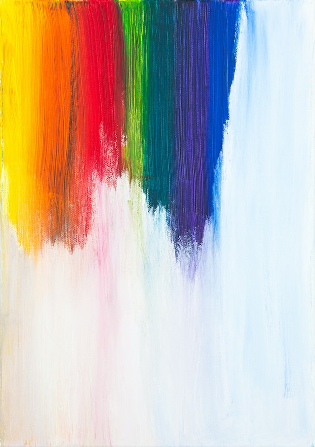
In modern primary color theory, there is also a recognition of color systems and models that go beyond the three-primary color schemes. For instance, some artists and designers may incorporate additional primary colors, such as orange or violet, in their color mixing systems to create more nuanced palettes.
Overall, modern primary color theory is characterized by a flexible approach to color mixing and representation, taking into account the specific requirements and capabilities of contemporary art, design, and digital media. It encompasses a variety of color models and systems that have been developed to suit the needs of modern technology and artistic expression.
How are Modern Primary Colors used in art ?
In art, modern primary colors or complementary colors, particularly the RGB color model, are used in various ways to create vibrant and dynamic compositions. Here are some ways modern primary colors are used in art:
Digital Art
In digital art, artists utilize the RGB color model to create artwork directly on computer screens or other electronic displays. By manipulating the intensities of red, green, and blue light, artists can achieve a wide range of colors and effects. Digital artists often work with software that provides precise control over RGB values, allowing for detailed color manipulation and experimentation.
Graphic Design
Modern primary colors are extensively used in graphic design for various purposes. They are often employed in creating visually striking designs, logos, advertisements, and user interfaces. The RGB color model allows designers to achieve vibrant and eye-catching color combinations that can effectively capture attention and convey messages.
Photography and Image Editing
RGB is the primary color model used in digital photography and image editing software. Photographers can adjust the levels of red, green, and blue channels to manipulate and enhance the colors in their images. The RGB color space provides a wide range of possibilities for color correction, tonal adjustments, and creative color grading.
Light Art
Artists working with light installations or light-based mediums often incorporate modern primary colors. Using various light sources and techniques, they can create captivating installations that explore color interactions, luminosity, and visual effects. Red LED lights or Green LED lights or Blue lights or White lights for example, offer precise control over the intensity of red, green, and blue, allowing artists to compose vibrant and immersive light-based artworks and yellow light as well. It also depends on the wavelength of light.
Print Design
Primary colors are essential in the printing industry. The CMYK model stands for cyan, magenta, yellow, and black- the four primary colors used in printing. This model is a subtractive model where colors are created through absorbing wavelengths of visible light. The combination of these primary colors produces a wide range of shades and hues that can be seen on printed material such as magazines, newspapers, and books. Understanding the concept of primary colors is crucial when it comes to producing high-quality printed materials.
It is important to note that modern primary colors are not limited to the RGB color model, and artists continue to work with various color systems and theories based on their preferences and artistic goals.
Relation between Primary and Secondary Colors
The connection between primary and secondary colors lies in the process of color mixing. Primary colors are the foundational colors that cannot be created by mixing other colors. Secondary colors, on the other hand, are created by combining two primary colors in equal or varying proportions. This relationship forms the basis of color theory and allows for the creation of a broader spectrum of colors.
When you mix two primary colors together, you get a secondary color. Here are the primary-secondary color relationships:
Red + Blue = Purple: Mixing red and blue in varying amounts creates shades of purple.
Blue + Yellow = Green: Combining blue and yellow in different ratios produces various shades of green.
Red + Yellow = Orange: Blending red and yellow results in shades of orange.
The secondary colors, purple, green, and orange, are considered distinct from primary colors because they are created through a process of color mixing. However, secondary colors can be used as primary colors in further color mixing. For example, orange can be mixed with blue to create a tertiary color such as brown.

The connection between primary and secondary colors is important in understanding color harmonies and relationships in art, design, and other creative endeavors. By combining primary and secondary colors, artists can create a diverse range of hues, shades, and tones to convey different moods, evoke emotions, and achieve visual balance in their work.
Primary Color Pigment
In the context of pigments, primary colors refer to a set of colors that are considered the building blocks for mixing and creating other colors. The primary colors used in pigments differ from the primary colors in light-based color models like RGB.
In traditional pigment-based color mixing, the primary colors are:
Cyan : A blue-green color that is often associated with coolness and tranquility.
Magenta: A reddish-purple color that falls between red and blue.
Yellow: A bright hue symbolizing warmth and brightness.
These three colors—cyan, magenta, and yellow—are known as the subtractive primary colors because when combined in different proportions, they can absorb or subtract certain wavelengths of light, resulting in the perception of various colors.
The subtractive primary colors are commonly used in color printing, painting, and mixing of physical pigments. By combining different amounts of cyan, magenta, and yellow, artists can create a wide range of secondary and tertiary colors. For example, mixing cyan and magenta creates blue, mixing magenta and yellow creates red, and mixing cyan and yellow produces green.
Primary colors in pigments are crucial for color mixing and allow artists to achieve a broad spectrum of colors in various artistic mediums.
Tertiary Colors
Tertiary colors are the colors that are created by mixing primary colors with secondary colors. In the traditional color theory based on the subtractive color mixing system (such as mixing pigments), the primary colors are red, blue, and yellow, and the secondary colors are green, purple, and orange.
When primary colors are mixed with secondary colors, tertiary colors are produced
These tertiary colors offer a wide range of intermediate shades and tones that provide more nuanced and complex color palettes. They can be used to add depth, subtlety, and visual interest to artwork, design projects, and various creative endeavors.
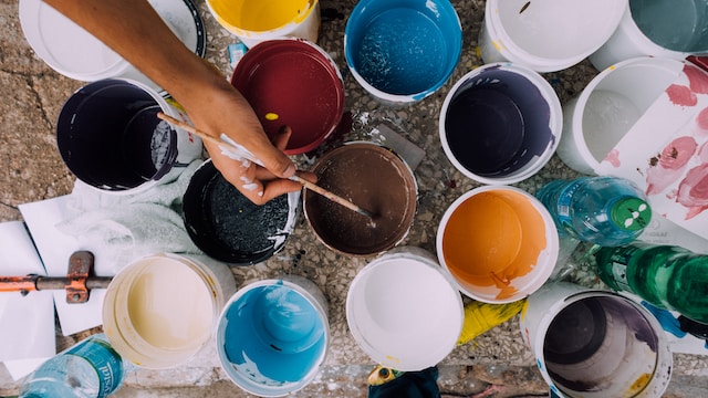
The specific hues of tertiary colors may vary depending on the proportions and intensities of the primary and secondary colors used in the mixing process.
Color Theory by Sir Issac Newton:
Isaac Newton’s color theory played a significant role in advancing the understanding of light and color. Newton conducted experiments with prisms in the 17th century and published his findings in his book “Opticks” in 1704. Here are the key principles of Newton’s color theory:
Spectrum of Colors
Newton discovered that when white light passes through a prism, it splits into a spectrum of colors. This spectrum consists of a continuous sequence of colors, starting from red and progressing through orange, yellow, green, blue, indigo, and violet.
Primary Colors of Light
Newton proposed that the primary colors of light are red, green, and blue. He believed that these three colors are the fundamental components from which all other colors can be derived. By combining different intensities of red, green, and blue light, one can create a vast range of colors.
Color Mixing
Newton’s color theory was based on the additive color mixing model. He suggested that by superimposing different colors of light, they would add together to produce new colors. For example, red and green light combined to create yellow, while red and blue light combined to form magenta.
Color Perception
Newton discussed how the perception of color is a result of the interaction between light and the human visual system. He proposed that colors arise from the different frequencies of light waves and how they are processed by the human eye and brain.
Newton’s color theory was groundbreaking at the time and laid the foundation for later developments in color science. It contributed to the understanding of the nature of light, the concept of primary colors, and the additive color mixing model. Newton’s work paved the way for the development of modern color theories and models used in various fields, including art, design, and technology.
Newton also concluded that each of these primary colors has a specific wavelength of light that is associated with it. When these primary colors are combined in different ways, they can create all the other colors on the visible spectrum. For example, when blue and yellow are combined, they create green because the wavelengths of blue and yellow light combine to form the wavelength of green light.
Color Model Approach
The color model approach refers to the various systems or models used to represent and describe colors. These models provide a structured way to define and communicate colors in a standardized manner. There are several color models commonly used in various fields, including:
RGB (Red, Green, Blue)
The RGB color model is an additive color model in which red, green, and blue light are combined in various intensities to create a broad range of colors. It is widely used in electronic displays, such as computer monitors and televisions.
CMYK (Cyan, Magenta, Yellow, Key/Black)
The CMYK color model is a subtractive color model used in printing and graphic design. It represents colors by subtracting varying amounts of cyan, magenta, yellow, and black inks from white.
HSL/HSV (Hue, Saturation, Lightness/Value)
The HSL (Hue, Saturation, Lightness) and HSV (Hue, Saturation, Value) color models are similar in concept and represent colors based on their hue, saturation, and lightness/value components. These models are often used in computer graphics, image editing, and color selection tools.
Pantone Matching System (PMS)
The Pantone Matching System is a proprietary color model used in the printing industry. It assigns unique numerical codes to specific colors, allowing for consistent color reproduction across different printing processes and materials.
Conclusion
In the end, primary colors play a fundamental role in color theory and artistic practices. They are considered foundational colors that cannot be created by mixing other colors. The traditional primary colors are red, blue, and yellow, while in modern contexts, primary colors can vary depending on the color model or system being used, such as the RGB or CMYK models.
Primary colors are essential for color mixing, as they can be combined to create secondary colors. Secondary colors are produced by blending two primary colors in various proportions. The relationship between primary and secondary colors forms the basis of color theory, allowing artists to create a wide range of hues, shades, and tones.
Primary colors are used in various artistic disciplines, including painting, digital art, graphic design, photography, and more. They can evoke different emotions, convey messages, and create visual impact. Artists often experiment with primary colors and their combinations to achieve desired effects and create harmonious compositions.

Leave a Reply