
In the world of art, contrast plays a vital role in captivating the viewer’s attention and is considered one of the fundamental principles of art.
Simply put, contrast is all about highlighting differences in various elements within an artwork. Think of it as the spotlight that makes certain parts stand out against others.
Artists utilize contrast in different ways to create visually striking compositions.
By juxtaposing elements such as color, texture, value, or shape, they can create depth, emphasis, and interest in their artwork.
Let’s delve into why artists harness the power of contrast and explore some examples from art history to better understand its significance and impact.
What is Contrast in Art?
In art, contrast is like the spice that makes a dish pop. It’s the technique of using different visual elements side by side to make them stand out and create a sense of balance and depth in the artwork.
Contrast isn’t just about making things look cool; it’s also a powerful tool for artists to convey meaning or draw attention to specific parts of their work.
For example, in a photograph, contrasting colors might emphasize the subject’s emotions, or in a sculpture, contrasting textures could highlight different aspects of the piece.
Overall, contrast is like the secret ingredient that adds flavor to art, making it more vibrant, engaging, and dynamic.
7 Principles of Art
Contrast is one of the principles of art, not elements of art. You can learn about each principle of art and element of art in the linked articles below:
- Balance
- Contrast and Emphasis (we are reading about contrast now!)
- Movement and Rhythm
- Unity and Variety
- Harmony
- Pattern
- Proportions and Scale
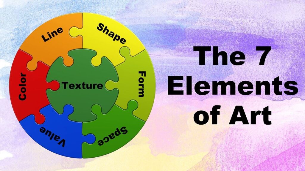
7 Elements of Art
4 Types & Examples of Contrast in Art
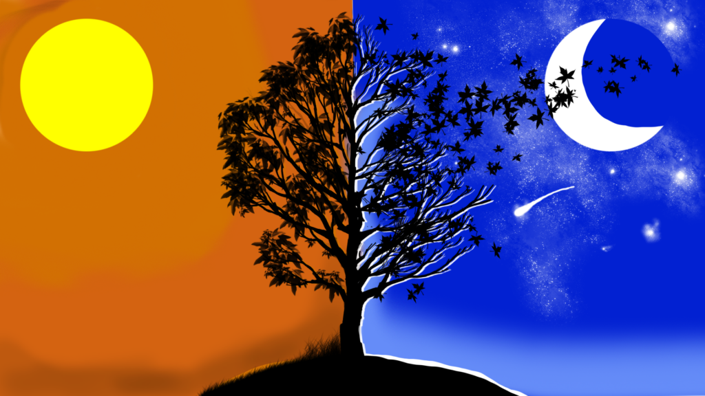
In the world of art, one of the simplest ways artists achieve contrast is by playing with the balance between light and dark areas, known as values.
But there’s more to it than just that! Contrast can also be created through color – think of bold hues standing out against muted tones – or through the differences in shapes and textures within the artwork.
So, whether it’s tweaking the brightness, mixing vibrant colors, or playing with different shapes and textures, artists have a variety of tools at their disposal to make their work pop and catch the eye.
Let’s take a detailed look into each of these four different types of contrast.
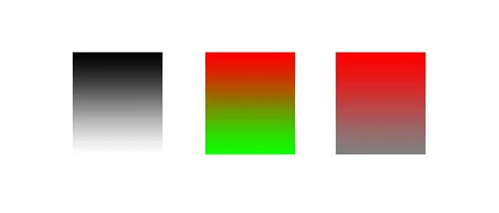
Value Contrast Art
In art, contrast is like adding spice to a dish – it makes things interesting and draws your attention. One type of contrast artists use is called “value contrast.” This is all about playing with light and dark tones to create depth and make things look more 3D.
Imagine you’re drawing a picture of a landscape. If you make the trees and grass really dark and the sky and water really light, you’re using high-value contrast. It’s like turning the brightness up to the max.
But if you make everything kind of similar in brightness, like the colors blend together more, that’s low-value contrast.
For example, take Monet’s painting “On the Bank of the Seine.” It’s pretty chill. That’s because Monet used mostly low-value contrast. The colors are kind of similar in brightness, so it feels calm and peaceful.
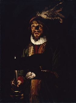
But then, check out Van Honthorst’s painting “Old Woman Examining a Coin.” Now that’s a dramatic scene! He cranked up the value contrast, with deep shadows and bright highlights. It’s like turning the drama knob all the way up.
Remember those funky optical illusion drawings from the 1960s? That’s another example of contrast at play. Artists during the Op Art movement used tonal contrast to mess with our minds.
They played with light and dark, making shapes look like they’re moving or popping out of the page.
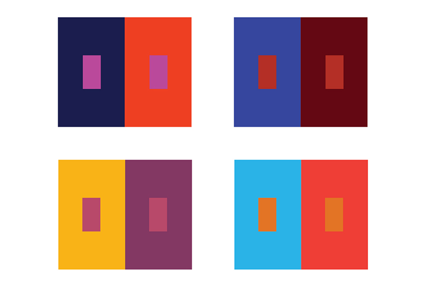
Color Contrast Art
In art, contrast plays a vital role in creating visual impact and interest.
One type of contrast often seen is color contrast, which involves the use of different hues and saturation levels to create striking effects.
High color contrast occurs when artists use complementary colors, which are colors opposite each other on the color wheel.
For instance, combinations like blue and orange, purple and yellow, or green and red create a strong visual contrast. This technique results in bold and vibrant images.
On the other hand, low color contrast is when artists opt for a more subdued or monochromatic look, using colors that are closer in hue and saturation.
Vincent Van Gogh, a renowned artist, frequently employed hue contrast in his paintings.
In his self-portrait, he used complementary colors of red and green to create exceptional contrast. Similarly, in “Starry Night Over the Rhone,” the contrast between dark blue water and light yellow star reflections produces depth and three-dimensionality.
The saturated blue balanced with bright yellow also brings harmony and a calming atmosphere.
In contrast, Van Gogh’s “Path in the Park of Arles with Walkers” demonstrates low color contrast, primarily using shades of green. However, despite the lack of hue variety, the painting maintains depth through variations in light and dark values within the green shades.
Shape Contrast Art
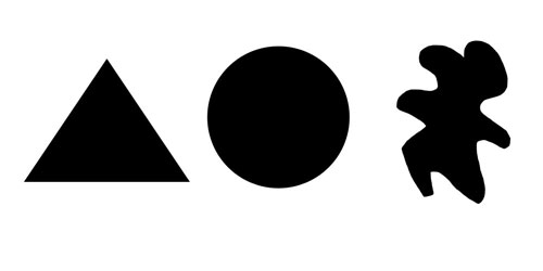
Shape contrast in art refers to the way artists use different types of shapes to create interest and impact in their work.
Imagine a painting or drawing where some shapes are sharp and angular, while others are soft and curvy. This play of opposites can make the artwork more dynamic and captivating.
For example, take Henri Rousseau’s painting “The Laundry Boat of Pont de Charenton.”
In this artwork, you can see a beautiful landscape where contrasting shapes come together harmoniously. The clouds and trees have organic shapes with soft edges, creating a sense of gentleness.
On the other hand, the buildings are represented by rigid, rectangular shapes with sharp edges, giving a feeling of solidity and structure. These opposing shapes work together to make the painting visually striking.
Another example is Gejza Schiller’s “Landscape with a bridge.” Here, the artist uses identifiable shapes to create contrast.
Some parts of the landscape have round shapes, while others have more angular forms. This contrast grabs your attention and leaves a strong impression on the viewer.
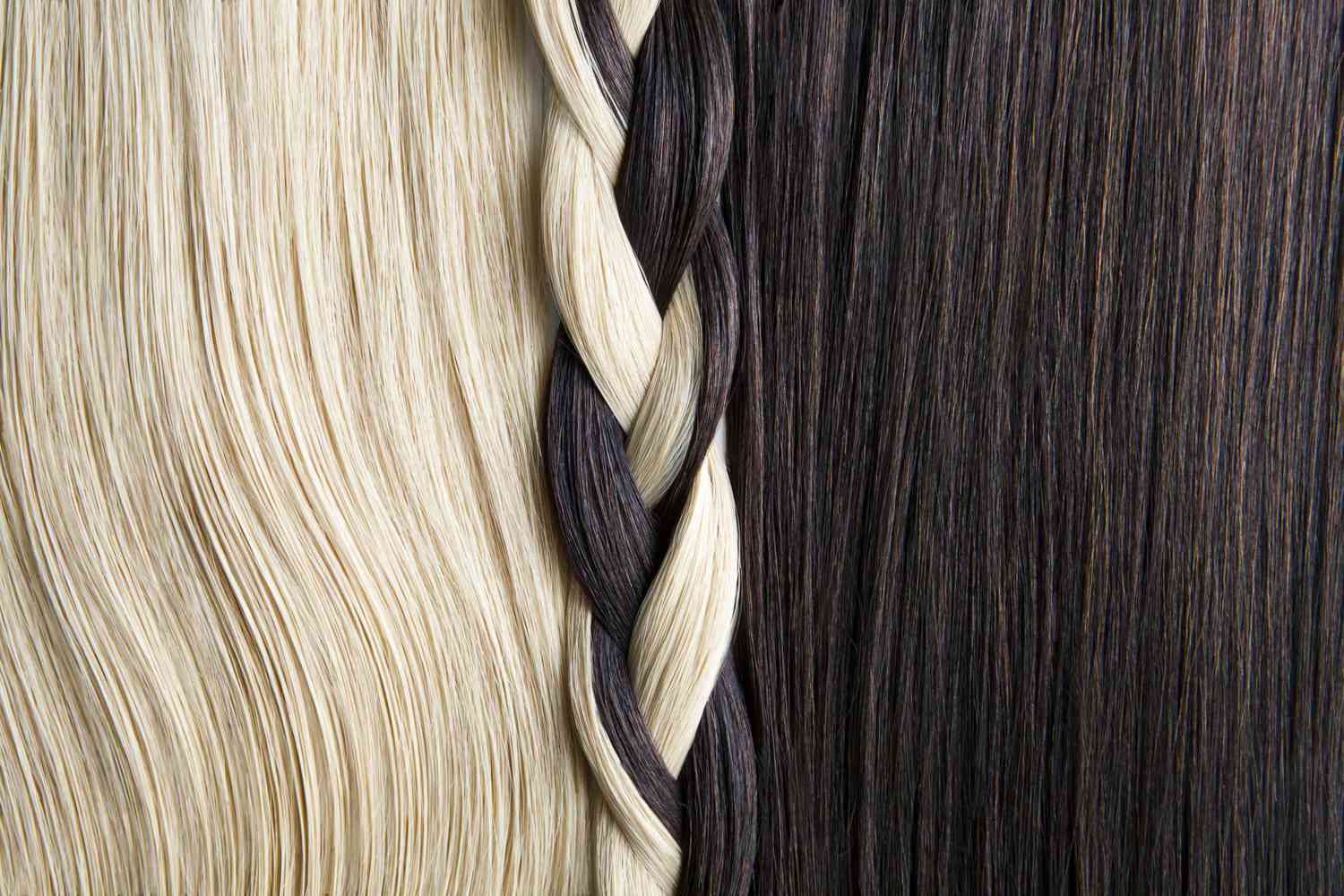
Texture Contrast Art
Texture contrast in art involves using both smooth and rough surfaces within an artwork.
When artists play with texture, they add depth, create the illusion of movement, or enhance drama in their pieces. In painting, texture can refer to how the brushstrokes are applied. There are two main types of texture: tactile and implied.
Tactile texture is something you can physically feel by touching the artwork. For example, when Van Gogh applied thick paint to his canvas in his famous work “The Starry Night,” you could feel the texture created by his brushstrokes.
Implied texture, on the other hand, can’t be touched. Instead, it’s an illusion created through artistic techniques.
For instance, an artist might use shading or lines to make a surface appear rough even though it’s actually smooth.
An excellent example of texture contrast in contemporary art is seen in the work of artist Justin Gaffrey. His textured landscapes combine rough and smooth surfaces, giving his acrylic paintings a sculptural quality that brings them to life.
What Can Contrast be Used For?
Contrast, in simple terms, is like putting opposites side by side. It might seem strange, but when done right, it can make things look really good.
Here are some ways we use contrast:
- Telling a Story: Think of it like adding different colors to a painting. Each color tells a different part of the story, and when they contrast, it makes the story more interesting.
- Making Things Look Better: Just like how a colorful outfit can stand out in a crowd, using contrast can make things look more appealing.
- Creating Different Feelings: Contrast can make you feel different things. It can make you feel excited or calm, depending on how it’s used.
- Drawing Attention: Imagine a spotlight on a stage. Contrast is like that spotlight—it helps draw your eye to what’s important in a picture or a scene.
- Making Things Clear: Sometimes, things can be confusing. Contrast helps clear up what’s going on by showing the differences between objects or ideas.
So, in short, contrast is like a magic wand for making things look better, telling stories, and grabbing attention. It’s a super useful tool for artists, designers, and anyone who wants to make things look great!
Why is Contrast Important In Art?
Contrast in art is like the seasoning in a dish that makes it pop. It’s not just about making things look different from each other, but it adds depth and interest to the artwork.
Imagine looking at a painting where everything is the same color and shade. It would be like staring at a blank wall – pretty boring, right? Contrast changes that. It makes certain parts stand out, draws your eye to important details, and adds excitement.
But here’s the thing: too much or too little contrast can mess things up. Imagine eating a dish that’s too salty or too bland – it’s not enjoyable. Similarly, if there’s too little contrast in art, it can feel dull and lifeless. And if there’s too much, it might overwhelm your senses.
Artists play around with contrast to create the perfect balance. They mix light with dark, thick lines with thin ones, rough textures with smooth ones – all to create harmony and keep things interesting.
So, why is contrast important in art? Because it’s what makes art exciting, captivating, and memorable. It’s the secret ingredient that turns a simple picture into a masterpiece.
How Can You Use Contrast in Your Art?
Using contrast in your art can really make your work pop and grab attention. Here’s how you can do it:
First off, plan your artwork’s layout. Think about how you want everything to fit together. Make a few rough sketches to figure out the best arrangement.
Decide where you want the viewer’s eyes to go – that’s your focal point. Then, think about where you can add contrast to make that focal point stand out.
You can create contrast in lots of ways – with color, texture, and shape. For example, if you’re using color, try pairing opposite colors on the color wheel to make them really stand out against each other.
Once you’ve got your plan sorted, start putting your artwork together. Begin with lighter colors or softer textures, and then gradually add darker colors or sharper textures to increase the contrast. Take your time – you can always tweak things as you go.
But remember, balance is key. Too much contrast can be overwhelming and distract from your artwork.
So, step back every now and then and make sure everything looks harmonious. A handy trick is to take a black-and-white photo of your work to see if the contrast levels are just right.
With a bit of planning and experimentation, you can use contrast to take your art to the next level and really make it pop!
Techniques to Create Contrast in an Artwork
There are a number of established techniques used by the old masters, that you can try for yourself to create contrast in your paintings.
Chiaroscuro
To create contrast in an artwork, artists use various techniques to make certain elements stand out. One of these techniques is called chiaroscuro.
Chiaroscuro is like painting with light and shadow. It’s an Italian word that means “light-dark“.
Artists use this technique to create the illusion of depth and volume in their paintings. They do this by using contrasting light and dark colors. This technique is often seen in paintings of people or objects, where the use of light and dark shades helps to make them look more lifelike.
During the Renaissance period, famous artists like Leonardo da Vinci and Michelangelo were masters of chiaroscuro. They used it to give their paintings a sense of drama and realism.
By skillfully blending light and shadow, they were able to make their figures seem more three-dimensional, almost as if they were popping out of the canvas.
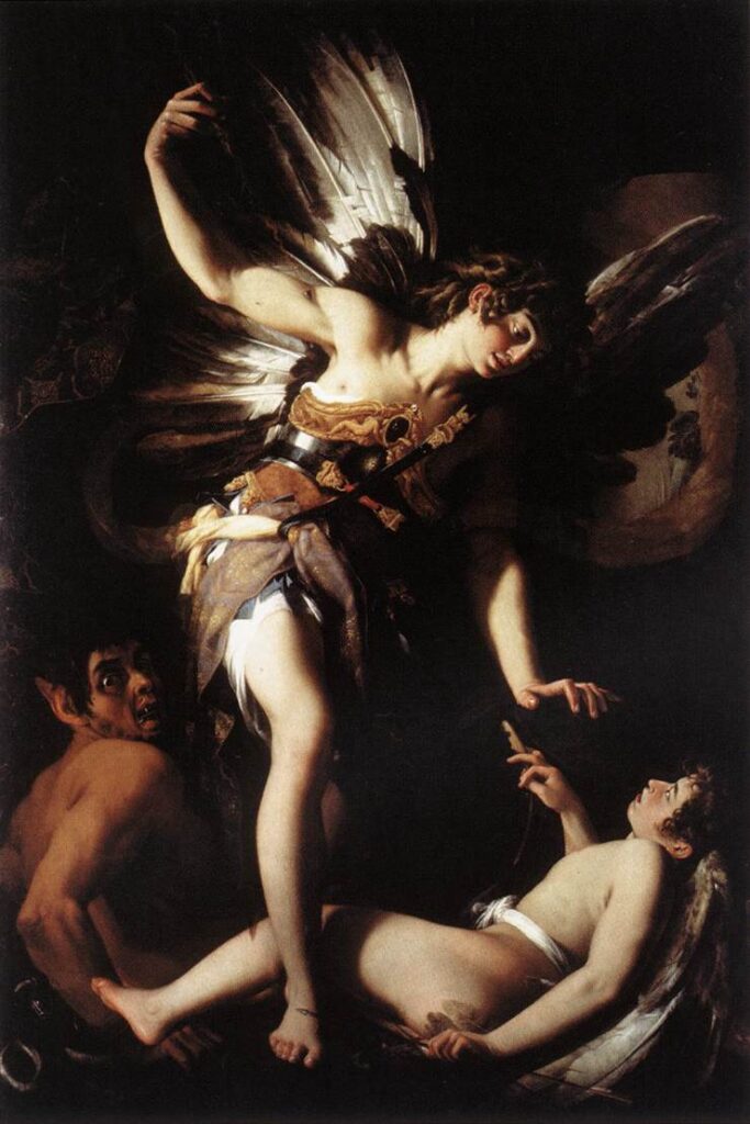
Tenebrism
Tenebrism is a fancy word for a painting technique that’s all about contrast.
Picture those paintings where some parts are really dark, almost like they’re hiding in shadows, while other parts are super bright. It’s like they’re playing with light and dark to make things pop out more.
Think about those old religious paintings you might have seen in museums. The artist might use tenebrism to make the scene feel more intense or mysterious.
They do this by using dark colors to make some parts really shadowy, and then bright colors to make other parts stand out.
Famous artists like Caravaggio and Rembrandt were big fans of this technique. They used it to make their paintings look super dramatic and emotional.
So, if you see a painting where some parts are super dark and some parts are super bright, chances are they’re using tenebrism to make it more intense and exciting.
FAQ’s:
What is a Good Example of Contrast?
Imagine that there is a painting with a large amount of bright areas as well as dark areas. The bright areas draw the eye because that is the natural reaction for our eyes to take. The eye will likely try to avoid the dark areas because it cannot see what is in the darker areas.
What is Contrast in Art and why is it Important?
Contrast is the representation of opposite sides of a design element, like brightness versus darkness. It is important because it creates focal points for the image, which are areas that draw viewers’ gaze.
What is an Example of Contrast in Design?
Contrast in design can take many forms. Designers can use different, contrasting colors to create a focal point/attention grabber for an ad or an article, for example.
Conclusion
In the realm of art, contrast is the spice that transforms a mere canvas into a captivating narrative.
It’s the subtle interplay of light and shadow, color and texture, that breathes life into the artwork, guiding the viewer’s gaze and evoking emotions.
Too much contrast overwhelms, while too little leaves the work flat; artists deftly balance these elements to create harmony and intrigue.
Contrast isn’t just a tool; it’s the heartbeat of every stroke, every hue, infusing depth, vitality, and significance into the masterpiece, making art come alive with stories, aesthetics, and emotions.
Leave a Reply