
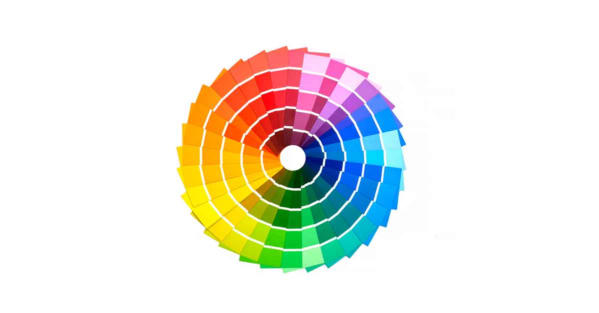
Colors are all around us, painting the world in hues that evoke emotions and sensations.
Whether it’s the calming blue of the sky, the vibrant green of nature, or the warm red of a sunset, colors have a profound impact on how we perceive our surroundings.
Skilled designers harness the power of these colors to elicit specific emotions and reactions from their audience.
For instance, red is often used in fast food logos to stimulate hunger, while green is employed by sustainable brands to evoke thoughts of nature and health.
By delving into the science and art of color meanings, entrepreneurs and designers alike can craft designs that are not only visually appealing but also resonate with their target audience on a deeper level.
Understanding the psychology behind colors allows for the creation of more effective and memorable designs that leave a lasting impression.
Where Do Color Meanings Come From?
Color meanings originate from various sources, reflecting both primal instincts and cultural influences.
For instance, green is linked with growth and vitality due to its association with flourishing vegetation, a primal connection ingrained in our minds.
However, historical events and societal contexts have also shaped color connotations. Take the example of 18th-century Europe, where green’s association with poison and death emerged because green dyes contained arsenic, a deadly toxin.
Over time, these meanings evolve. Green transformed from a symbol of danger to a representation of freshness and eco-consciousness, visible in today’s branding strategies.
Similarly, cultural backgrounds play a significant role. In Japan and China, orange signifies happiness and prosperity, demonstrating how cultural contexts dictate color interpretations.
Moreover, historical events often underpin color symbolism. In South Africa, red symbolizes mourning due to its association with bloodshed and sacrifice, honoring those who lost their lives.
Conversely, mourning colors vary across cultures, with white or black being more common choices elsewhere.
The Varied Meanings Of Color
Understanding the meaning of colors can vary widely depending on different factors.
Here’s how various aspects of life influence our interpretation of color:
- Geography: Different countries or regions attach distinct meanings to colors. For instance, while black symbolizes mourning in America, in China, white is the color associated with grief.
- Current Events: Cultural and political events shape our perceptions of colors. For example, in the 2000 U.S. presidential election, Democrats became associated with blue and Republicans with red.
- Religious Affiliation: Colors hold diverse symbolism across religions. Purple, for instance, may represent suffering, royalty, or intuition depending on one’s religious background.
- Societal Groups: Certain colors serve as symbols for specific communities, like the rainbow flag for LGBTQ inclusion and support.
- Team Affiliation: People often develop strong attachments to colors associated with their favorite sports teams or alma mater. Conversely, they may dislike the colors of rival teams.
- Generation: Different generations tend to have nostalgia for particular color schemes, influencing their preferences.
Considering these factors is crucial for professionals like designers and marketers. Market research is essential before finalizing brand colors, especially if targeting specific demographics.
For example, if your target audience consists mainly of Gen Xers in Asia, you’d prioritize different colors compared to targeting seniors in the U.S.
The Relationship Between Color Meanings and Emotion
Colors and their meanings can be complex. There is no doubt that certain colors can evoke certain emotions within us.
Whether it’s rooted in a biological, evolutionary, or cultural element, there’s a universal understanding of certain colors invoking specific feelings. .
Let’s take a look at these colors and ask ourselves, what do colors mean and how do they impact us emotionally?
Red

Red is like the fire burning inside you – it’s intense and full of energy. It’s the color of love and passion, but also of anger and danger.
When you see red, you feel warmth and strength, but you might also feel the urge to stop or take caution, like when you see a stop sign.
It’s not just a color; it’s like a shot of adrenaline.
Red can make your heart race, your breath quicken, and even make you feel hungrier. That’s why many fast-food places use red in their logos and designs – to grab your attention and get you excited about their food.
If you want to catch someone’s eye or make them take action, red is your go-to color. Just be careful not to overdo it – too much red can be overwhelming.
So, use it wisely, especially for things like food brands or websites where you want people to notice and act fast.
Orange
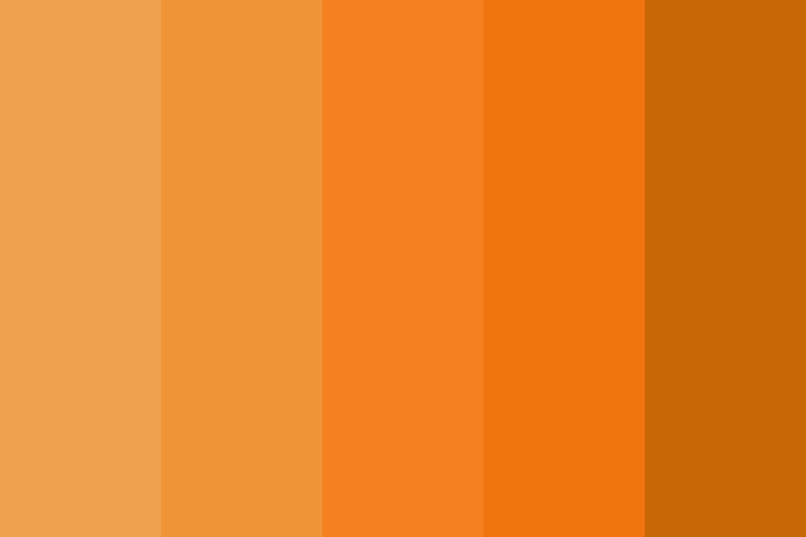
Orange is a color that packs a punch when it comes to emotions and meanings.
It’s like a burst of energy, making you feel lively and youthful. You know those traffic cones and bright jackets you see?
Yup, they’re orange because they want to grab your attention and warn you. But it’s not just about caution; think about juicy oranges, they make you think of health and freshness, right?
When you see big brands like Nickelodeon or Gatorade using orange, they’re tapping into this energy. It’s like they’re saying, “Hey, let’s have some fun and get moving!” Orange is all about being playful and lively, like a friend who’s always up for an adventure.
So, when should you use orange?
Well, if you’re working on something creative or you want to grab people’s attention, orange is your go-to color. It’s perfect for promoting new stuff or getting people to take action.
Plus, it gives off this warm and inviting vibe, making everyone feel welcome. So, if you want your project to feel friendly and exciting, orange is the color for you.
Yellow
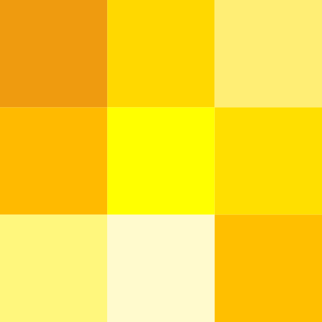
Yellow is a color that’s full of sunshine vibes! When people see yellow, they often feel happy and full of energy. It’s like bringing a piece of the sun into their day. Yellow symbolizes warmth, joy, and hope.
But wait, there’s more to yellow! It’s also a color of caution. Think about those yellow street signs or police caution tape. Yellow is saying, “Hey, watch out!” because it’s so visible even from far away.
So, if you’re a brand that wants to spread cheer and optimism, yellow is your buddy.
Companies use it to show that their products are happy and affordable. Imagine those golden arches of McDonald’s – they’re like a big yellow smile saying, “Come on in and enjoy!”
So, if you’re planning a sale, slap some yellow tags on your products and watch the positivity flow!
Green

The color green has a deep connection with nature, like grass, trees, and plants.
When we see green, it often makes us feel peaceful and balanced, like taking a stroll through a forest. It’s also linked with growth and starting anew, just like how plants sprout in the springtime.
In places like the U.S., green is connected with money and stability. You’ll notice many famous brands using green, such as Whole Foods Market, Starbucks, Heineken, and Spotify.
So, what does green symbolize? Well, it represents nature, that sense of calm and balance, growth, renewal, as well as wealth and stability.
If you’re thinking about using green, it’s great for brands that focus on being eco-friendly, organic, or sustainable, or if you’re selling natural products.
It can also give off a feeling of prosperity and plenty in your designs or business. Just be careful with super bright greens, as they might feel more fake than natural.
Blue

The color blue is like a calming wave washing over your emotions. Think of the vast expanse of the sky or the deep sea – that’s blue.
When you see blue, it’s like taking a deep breath and feeling at peace. It’s a color that makes you feel safe and trustworthy, like you can rely on it.
Dark blue is like a powerful statement, it’s authoritative and says, “I mean business.” Lighter blues are more like a friendly hug, they’re relaxing and easygoing.
Big companies like Twitter, Facebook, and American Express choose blue for their logos because it’s a color that people automatically trust. It’s like the friend you know will always have your back.
So, when you want to give off a vibe of responsibility and reliability, blue is your go-to color. It’s perfect for businesses, politicians, or anyone who wants to be seen as dependable and trustworthy.
Purple

Purple is a color that holds many meanings and can evoke various emotions. It’s often associated with royalty, luxury, and mystery.
Think of it as a blend of warm and cool colors, like red and blue mixed together. This mix gives purple a unique appeal, symbolizing creativity, wealth, and spirituality.
Interestingly, purple tends to resonate more with women, which is why it’s often used in products and designs targeting them. You might notice it in beauty products or logos of brands aimed at a female audience.
If you’re thinking about using purple in your branding or design, consider its associations. It’s great for creating a sense of luxury, femininity, and uniqueness.
When used appropriately, it can add a touch of royalty and mystique to your brand’s image.
While purple isn’t as common in branding as some other colors, choosing the right shade can make your logo stand out and convey the message you want to send.
Pink

The color pink is more than just a hue; it’s a mood in itself. When we see pink, we often feel playful, feminine, and even romantic.
Think about bubble gum, cotton candy, or a sweet, cute vibe – that’s pink. In lighter shades, it gives off a soft, sentimental feeling, while brighter pinks are bold and full of youthful energy.
Many well-known brands, like Dunkin Donuts, Lyft, Barbie, T-Mobile, and Baskin Robbins, use variations of pink in their logos.
This color symbolizes playfulness, femininity, romance, sweetness, and youthfulness.
How to make the most of it? Pink is fantastic for brands targeting a feminine and playful audience, especially those in dessert-related products.
But here’s the thing: pink isn’t just for girls. When used cleverly, it can be bold, fun, and even gender-neutral.
So, whether you’re designing a logo or creating a product, consider pink for a memorable touch.
Brown
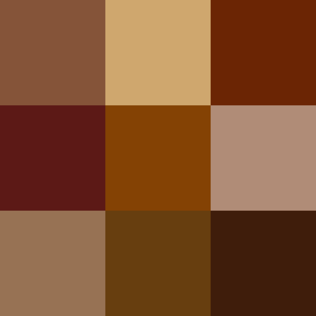
Brown, with its earthy and warm tones, evokes feelings of wholesomeness and reliability.
Think of the rich color of soil, the sturdy strength of wood, or the comforting taste of chocolate. It’s a color that connects us to nature, reminding us of the outdoors and the enduring qualities of the earth.
In branding, brown is often associated with established and trustworthy vibes. Brands like M&Ms, UPS, and Hershey’s use brown in their logos to convey durability and reliability. It’s a color that suggests tradition and solidity.
For businesses, especially those in industries like chocolate, whiskey, or natural beauty products, brown can be a powerful choice. It gives off a sense of simplicity, durability, and a connection to the natural world.
So if you want your brand to feel grounded and established, brown might be the perfect color choice for you.
Black
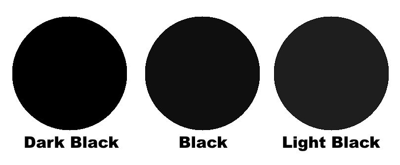
The color black carries a lot of meaning and emotion. It’s a color that can be both powerful and versatile.
On one side, black represents luxury, sophistication, and exclusivity. Think of high-end brands like Chanel or Dior – they often use black to convey elegance and prestige.
However, black also has darker connotations, symbolizing death, mourning, and even evil.
Despite these contrasts, black remains a popular choice because of its ability to blend classic and modern styles seamlessly.
Brands like Adidas, Sony, and The New York Times incorporate black into their designs to evoke a sense of strength and sophistication.
So, when it comes to using black in design or branding, it’s essential to consider the message you want to convey.
For luxury, modern, or exclusive brands, black can enhance the feeling of power and elegance. It’s also suitable for formal and serious projects, adding a touch of sophistication and authority.
Meaning of Colors in Logo Design
Colors in logo design convey various meanings and emotions, rooted in both primal instincts and cultural associations.
- Green: Traditionally associated with growth and nature, but historically seen as a color of poison due to arsenic in dye. Now, it’s often linked to eco-friendliness and vitality.
- Orange: Symbolizes happiness and prosperity in Japan and China, showcasing cultural differences in color meanings.
- Red: In South Africa, it represents mourning, symbolizing bloodshed and sacrifice, while in many other cultures, white or black are associated with mourning.
- Color Combinations: Combining colors can evoke different feelings; for instance, light blue and white can feel “chilly,” while brown and pink may remind people of sweets.
Understanding color meanings involves considering various factors:
- Shade, Tint, or Tone: Different versions of a color can convey different emotions.
- Combination with Other Colors: The way colors interact can alter their meaning.
- Saturation: How intense or muted a color is affects its impact.
- Pairing with Other Design Elements: Fonts, shapes, and other design elements influence how colors are perceived.
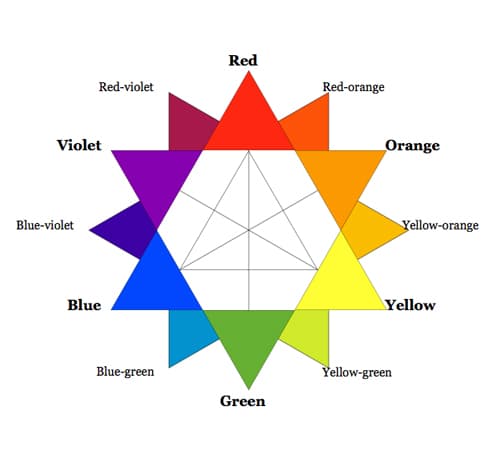
To create effective color combinations, it’s crucial to grasp the basics of color theory and how colors interact with each other and other design elements.
Ultimately, the meaning of colors in logo design is multifaceted and influenced by a range of factors.
Conclusion
In summary, colors are not just visual elements but powerful communicators of emotions and messages. They carry diverse meanings shaped by cultural, historical, and personal contexts.
By understanding these nuances, designers and marketers can craft designs that resonate deeply with their audience.
From the calming blue of trustworthiness to the vibrant energy of red, each color evokes specific feelings and associations.
Moreover, the combination of colors and their interactions with other design elements further influences their impact.
By mastering color theory and considering factors like shade, saturation, and pairing with fonts and shapes, designers can create compositions that effectively convey their intended message.
Ultimately, colors play a crucial role in shaping perceptions and creating memorable experiences for audiences across various platforms and industries.
Leave a Reply